EXERCISES (20%)
WEEK 1 - WEEK 2
TIMEFRAME: JAN 9 - JAN 20

INSTRUCTIONS
EXERCISE BRIF
During the timeframe of Week 1 and Week 2, I am supposed to select the
design principles given. To create 2 designs using 2 design principles
each.
List of Design Principles given:
- Gestalt Theory
- Contrast
- Emphasis
- Balance
- Repetition
- Movement
- Harmony & Unity
- Symbol
- Word and Image
VISUAL RESEARCH
GESTALT THEORY: FIGURE GROUND
Figure ground is a perception for the human cognition to distinguish the visual aspect of the main object and the background. The object
referred 'figure' while the background being
referred 'ground.'
Fig 1.1 Image from a blog by Joe Hensley
Fig 1.2 Illustration from Pinterest
GESTALT THEORY: CLOSURE
Closure is a visual strategy testing the human ability to use
their imagination to fill in the missing details of the artwork. It
helps people to see the bigger picture rather the details.
Fig 1.3 Illustration from Pinterest
Fig 1.4 Illustration from a blog by Eric Kim
REPETITION
Repetition means when curtain elements such as lines, shape, color are used repeatedly to form a diverse range of patterns or the create a rhythm.
Fig 1.5 Illustration from Pinterest
Fig 1.6 Illustration from Pinterest
UNITY
It means combining various design elements that are similar to one another
together, to create a create a complete piece.
Fig 1.7 Illustration from Pinterest
Fig 1.8 Illustration from Pinterest
DESIGN PROGRESS & IDEA EXPLORATION
DRAWING #1: "MAIN ATTRACTION"
DESIGN PRINCIPLE: REPETITION
I come up with the idea around the theme of a person's identity. I decided
to use fashion as my main subject as, within the fashion industry, it is a
very targeted industry, self-image, comfort, confidence and fashion goes
hand in hand. So, I did some research on fashion magazines covers to find a
model for my design and illustrations that will further enhance my
work.
REFERNCE MODEL
Fig 2.1 Unknown Model from Lanafia
INSPIRATION
Fig 2.2 Evil Eye Bracelets
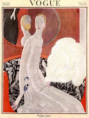
Fig 2.4 Vogue magazine cover illustrated by Eduardo Garcia Benito
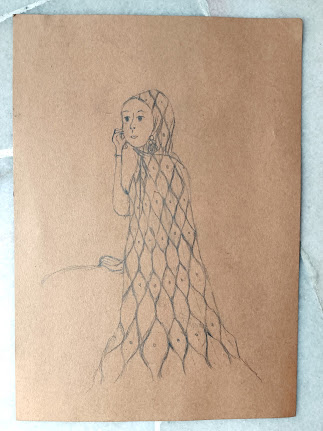
I drafted an unknown Muslim model as a reference, the eyes on hijab of the
Muslim model are inspired by the evil eye beads on a bracelet and the shape
of the eyes is model after the Turkish lamp. The eyes signify the stares of
the masses, it evokes attention. I use the repetition principle on the eye
to represent the public. Also, the lanky elements are inspired by the Vogue
Magazine cover because I want to give the hijab a wavy effect to grab the
viewers' attention.
Fig 2.5 Sketches of deconstructing item into shapes
Fig 2.6 Sketches on forming the pattern
Fig 2.7 "Main Attraction" Draft
DRAWING #2: "DEATH BY BREATH"
As for the second drawing it focuses on the theme of a no smoking policy. I
have created three sketch drafts using different design principles.
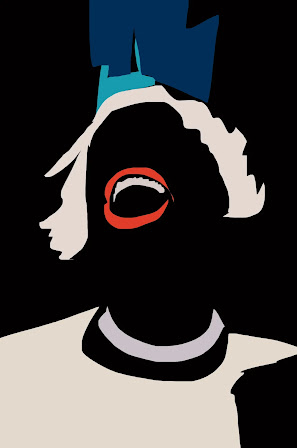
DRAFT 1 DESIGN PRINCIPLE: GROUND FIGURE
In Draft 1, illustrated in Figure 4.1 Death by Breath, I was inspired by
the simplistic design of the gestalt theory: figure ground. I drew the
cigarette smoke in the shape of skull to symbolize death if people continue
the habit.
INSPIRATION
Fig 3.1 Figure Ground illustration by Noma Bar
DRAFT 2 DESIGN PRINCIPLE: CLOSURE
For Draft 2, illustrated in Figure 4.1 Death by Breath, I used the closure element in gestalt theory, to illustrate one of the effects of smoking which is lung cancer. The replacement the actual lung with balloons is inspired by the lung balloon experiment made by children, and the cracked balloons serve as metaphor for lung cancer.
INSPIRATION
Fig 3.2 Silhouette of a Girl Smoking by Martin Janecek
Fig 3.3 Balloon Lung Experiment
DRAFT 3 DESIGN PRINCIPLE:
UNITY
Lastly, for draft 3 illustrated in Figure 4.1 Death by Breath, I used unity principle to create a cartoon to grab viewers' attention.
the design is inspired by the psychedelic underground street art to depict
the audience on how smoking can affect people physically. And I drew the
cigarette cloud as hands to exaggerate the fact that smoking causes
death.
INSPRATION
Fig 3.4 Acido Folklorico Enfermo by Iconblast
Fig 3.5 Marge Simpson by Dave Bell
Fig 3.6 Psyco Dudes by Galo
Fig 3.7 "Death by Breath" Drafts
I decided to pick Draft 1, illustrated in Figure 4.1 Death by Breath, as my final second drawing. But I was left unsatisfied so, I upgraded its
composition to make it less literal. I have done two more composition
drawing using the same principle which is gestalt theory: figure
ground.
"DEATH BY BREATH" DRAFT 1 REVAMPED VER.
VER NO.1
INSIPRATION
Fig 4.1 Skull Cloud by Laura Barbosa
The skull is inspired by the 'Skull Cloud' Illustration by Laura Barbosa, I replaced the teeth with cigarettes, and I play around with the volume of the waves to make the cloud distinguish itself. The shape of the eyes is inspired by the mask in the movie Scream to give a depressed look.
Fig 4.3 Draft 1: Revamped Ver. 1
VER NO.2
Fig 4.4 Dead Cloud Logo by Gregory Grigoriou
Fig 4.5 Draft 1: Revamped Ver. 2
FEEDBACK
Mr. Charles suggested that the hijab from Drawing 1 needs to be
extended and more exaggerated to make my character stand out a bit
more given the fact it is about people showing off their lavish
lifestyle.
As for Drawing 2, I showed Mr. Charles, my three drafts and he said that;
Draft 1 has nothing much going on, Draft 2 has some potential only he
didn't like the idea of the cigarette hanging from the mouth, and Draft 3
there is no design principle being identified but suggested the idea of
the Draft 3 character being trap in a smoking purgatory.
Now that I know Mr. Charles comments on Draft 1, I presented my two
revamped version of Draft 1, he liked the idea of cigarettes for teeth in
Revamp Version No.1, but he wanted the cloud to be extended For Revamp
Version No.2 that cloud lightning bolt doesn't create a stronger context
compared to Revamp Version No.1.
FINAL DRAWING
When constructing this final drawing I tried to change the art style by referencing make-up on supermodels and by using design elements from multiple vogue illustration instead of only one vogue illustration.
Fig 5.1 "Main Attraction" Final
I used the one of the Revamped Version of Draft 1. I did a few changes by extending the smoke and making the skull rounder and skinnier. I even add text that is overlapped by the smoke.
Fig 5.2 "Death by Breath" Final
REFLECTION
From this exercise, I learnt about gestalt theory which is something I
haven't heard of until now. It is interesting to learn that to create a good
design, I must understand the human perception to visualize my design and
how we can tie up loose ends of an image just by using
our imagination.
By being exposed to all the different design principles, there are some
areas that I am exploring such as Unity and Harmony principle. It is the
concept of compiling different types of objects but making them
relate to each other as a whole. To me the unity and harmony principle
is confusing because the usage is very conflicting.


.jpeg)


.jpeg)


.jpeg)


Comments
Post a Comment