Caitlin Ong Lynn Dee / 0343801 / Bachelor of Design (Hons) in Creative Media
Advanced Typography
Task 1/Exercise
CONTENTS
- AdTypo_0_TuringTheTable
- AdTypo_1_Typographic Systems
- AdTypo_2_Typographic Composition
- AdTypo_3_Context&Creativitiy
- AdTypo_4_DesigningType
- AdTypo_5_PrectionAndOrganisation
- Task 1 / Exercise 1: Typographic System
- Sketches
- Drafts
- Refinement
- Final Outcome
- Task 1 / Exercise 2: Type & Play
- Chosen Subject
- Letterform Extraction
- Reference
- Sketches
- Digitization
- Draft 1
- Draft 2
- Draft 3
- Final Letterform
- Final Letterform: Before Refinement
- Final Letterform: After Refinement (1st Update)
- Final Letterform: After Refinement (2nd Update)
- Final Letterform: After Refinement (3rd Update)
- Final Outcome
- Poster
- Draft
- Final Outcome
LECTURE
AdTypo_0_TuringTheTable
The knowledge we have gain in Design Principles will be applied to Advance Typography
AdTypo_1_Typographic Systems
According to Elam, 2007, there are 8 major variations with an infinite number of permutations. These 8 major variations are as follows:
- Axial
- Radial
- Dictational
- Random
- Grid
- Modular
- Transitional
- Bilateral
Typographic organization is a complex system because elements such as hierarchy, order of reading, legibility, and contrast work together to guide the viewers to show a clear communication. It serves as a blueprint that allows designers to explore further and develop new ideas.
Axis System - all elements are organized to the left or right of a single axis. The example here are courtesy have been sourced from type 365.

|
| Fig 1.1 Axis System |

|
| Fig 1.2 Axis System by Julius Teoh Hoong Boon |
Radial System - all elements are extended from a point of focus. The examples here are courtesy have sourced from type 365.

|
| Fig 1.3 Radial System |

|
| Fig 1.4 Radial System by Tamara Audrey |
Dilatation System - All elements expand from a central point in a circular fashion. The examples here are courtesy have been sourced from type 365.

|
| Fig 1.5 Dilatation System |

|
| Fig 1.6 Dilatation System by Julius Teoh Hoong Boon |
Random System - Elements appear to have no specific pattern or relationship.

|
| Fig 1.7 Random System |

|
| Fig 1.8 Random System by Tamara Audrey |
Grid System - A system of vertical and horizontal divisions

|
| Fig 1.9 Grid System |

|
| Fig 1.10 Grid System by Tamara Audrey |
Transitional system - An informal system of layers banding. The examples here are courtesy have been sourced from type 365.

|
| Fig 1.11 Transitional System |

|
| Fig 1.12 Transitional System by Julius Teoh Hoong Boon |
Modular System - A series of non-objected elements that are constructed in as a standardized unit.

|
| Fig 1.13 Modular System |

|
|
Fig 1.14 Modular System by Julius Teoh Hoong Boon |
Bilateral System - All text 8s arranged symmetrically on single axis.

|
| Fig 1.15 Bilateral System |

|
| Fig 1.16 Bilateral System by Tamara Audrey |
AdTypo_2_Typographic Composition
Principles of Design Composition
When it comes to composition, the first thing comes to mind is the dominant principles, which are emphasis, isolation, repetition, symmetry and asymmetry, alignment, perspective etc.
However, these elements are ambiguous when it's applied to typographic layouts or composition. They are mostly used for imaginary than complex units of information that consist if different elements.

|
| Fig 2.1 Using Rule of Thirds for paragraph compositions. |
Typographic Systems
From the 8 system, the most used system is the Grid System (or the Raster System), it originated from the grided compositional structure of Letter Press printing.
Later years the grid system was further enhanced by now it known as Swiss (Modernist) style of Typography, with its foremost proponents being Josef Muller Brockmann, Jan Tschichold, Max Bill and such.

|
| Fig 2.2 Many ways of using the Grid System |
Nowadays, Typography of the Modernist era, the next generation of designers bend the rules of this notion of order. Thus sparks the birth of the post-modernist era in the Typographical Systems where chaos, randomness and asymmetry were explored. Legibility and readability are taken a backseat. But it is important to combine the two seamlessly. Its proponents include David Carson, Paula Scher, Jonathan Barnbrook etc.

|
| Fig 2.3 Left to Right: Paula Scher, Jonathan Barnbrook & David Carson |
Environment Grid
This system revolves on the exploration of the of an existing structure or multiple structures combined. The structure can be architect structure or a painting or interior of a room. From there the crucial lines both curve and straight are extracted and from into something new. The designer organized the information around the intricate structure, to create a unique and exiting mixture of texture and visuals.
In conclusion the key features of the structure can be effectively used to create an interesting information alignment to communicate the message.
From Fig 2.4 show below. the important lines are created from images of a certain object. From there, the elements are simplified, and the information can be incorporate the based on the given framework to produce a unique layout design.

|
| Fig 2.4 Example by Lecturer Brenda McMannus from the book "Typographic Form and Communication" |
Form and Movement
Created by Mr. Vinod, the system is based on the exploration of the of an existing Grid System. It helps to explore variation option on what the grid system has to offer; to dispel the seriousness surrounding the application of the grid system; and to see the sequence of turning of page will be treated as a slowed- down animation in the form of constitutes the placement of the image, text and color.
Movement from spread to another is crucial in terms of book design, typographical layout and composition. It is important to have variation on the composition to keep reader engaged.

|
| Fig 2.5 Book Spreads mimic the frame-by-frame nature of moving screen. |
AdTypo_3_Context&Creativtiy
Handwriting
It important to study handwriting because mechanical produced letterform is designed to imitate handwriting. And handwriting serves as a guidance in order to translate it to the mechanical letterforms.
The shape and lines of hand drawn letterforms are influenced by the tools and materials used to make them. Example: charcoal, brushes sticks, plant stem etc.
This includes what type of material is used to write the words. Example: clay, papyrus, plam leaf, animal skin etc.
Evolution of Latin Alphabet

|
| Fig 3.1 Evolution of Latin Alphabet |
Cuneiform (3000 B.C.E) - the earliest system of writing. It was used in a number of languages through the 1st century C.E. lts distinctive wedge was formed by pressing the blunt end of a reed stylus into a wet clay table.

|
| Fig 3.2 Cueiform, 3000 BCE |
Hieroglyphics (2613-2160 B.C.E) - An Egyptian writing system used a mixture of both rebus and phonetic characters. It is considered the first link to future alphabetic system. Hieroglyphics images have the potential to be used in 3 different ways.
3 different ways:
- As ideograph, to represent the things they actually depict.
- As determinatives to show that the signs preceding is meant as phonograph and to indicate the general idea of the word
- As phonograms to represent sounds that "spell out" individual words.

|
| Fig 3.3 Ancient Hieroglyphics, 2613-2160 BCE |
Early Greek (5th C. B.C.E) - inspired by the Egyptian logo-consonantal system, the Phoenicians developed a phonetic alphabet consisting of 22 letters. They are usually drawn freehand with no serifs. Over time the stroke will grew thicker, the aperture lessened, and serifs appeared. The new form serves as a model for the formal lettering in imperial Rome, which are the words being chiseled on stones.

|
| Fig 3.4 Early Greek, 5th C. BCE |
Roman Uncial - during the 4th century Roman letter becomes more rounded, the curved form allows less strokes making the writing process faster.

|
| Fig 3.5 Roman Uncial |
English Half Unical (8th C.) - In England the uncial evolved to become more slanted and more condensed.

|
| Fig 3.6 English Half Unical, 8th C |
Carlingian Minscule - during the Charlamangne's patronage book production increased and language was standardized. rules are set for the letter structure; the pronunciation and spelling as well as writing conventions, capitals at the start of the sentence, spaces between words and punctuation. Thus, the new script emerged, the Carlingian Minscule. It was mainly used for all legel and literary works.

|
| Fig 3.7 Emperor Charlemagne 8 C. CE |

|
| Fig 3.8 Carolingian Minuscule lowercase |

|
| Fig 3.9 Carolingian Minuscule lowercase |
Black Letter (12-15 C. CE) - its characteristic is tight spacing and condensed lettering. Evenly spaced verticals dominated the letterform. Condensing line spacing reduced the number of costly materials in book production.

|
| Fig 3.10 Black Letter, 12-15 C. CE |
Movable Type (11 C. - 14 C) - printing (wood blocks) had been practiced in China, Korea and Japan (Dharami Sutra, AD 750). Earliest known printing book (AD 868) is the Diamond Sutra; 16' scroll with the world's 1st printed illustration. China had attempted to use movable type for printing but was unsuccessful due the large number of characters and usage of clay which is brittle.

|
| Fig 3.11 Movable Type |

|
| Fig 3.12 Punch and Matrix |
Handwriting part 2
It is important to respect the history that would pay homage to the developments. It is done by books being written about it and published.
With the digital revolution, we can digitalize the historical creations to market them and to sell or license them. That way the historic letterform can be recognized so people can learn from them.
Evolution of Middle Eastern Alphabets

|
| Fig 3.13 Evolution of the Middle Eastern Alphabets |
Evolution of the Chinese Scripts

|
| Fig 3.14 Evolution of the Chinese Scripts |
Indian Script
Indus Valley Civilzation Script (3500 - 2000 BCE) - The oldest writing found in the 'Indian' subcontinent. Is as yet undecided and seems to have been somewhat logo-syllabic in nature.

|
| Fig 3.15 Indus Valley Civilization Script, 3500 - 2000 BCE |

|
| Fig 3.16 Indus Script Seals |
Brahma Script (450 - 350) - develop after the indus script. It is one of the most influential writing systems; morden Indian script found in Southeast and East Asia are inspired by Brahmi.

|
| Fig 3.17 Brahma Script, 450-350 BCE |
Southeastern script
Pallava - The oldest writing systems present in Southeast Asia is Indian scripts. But the most important one is Pallava (or Pallawa in Malay), a South Indian script originally used for writing Sanskrit and Tamil. Pallava was highly influential, becoming the basis for writing systems across Southeast Asia.
Pra-nagari - There is also Pra-nagari, an early form of the Nagari script, uses in India for writing Sanskrit.

|
| Fig 3.18 Pra-nagari |
Kawi - Indonesia's most important historical script; Kawi. Based on Nagari, but indigenouus to Java. Intersting fact is that the Kawi script is used to contact with other kingdoms. The script is so popolular it become the basis for other scripts Indonesia and Philippines. This means that ancient kindoms of the Malay Peninsula would have been using both Indian scprits and Kawi to write old Malay language.

|
| Fig 3.19 Laguna Copperplate Inscription written in Kawi |
Incung - a writing system from from Kerinci

|
| Fig 3.20 Incung |
Rejang Script

|
| Fig 3.21 Rejang Script |
Batak Script

|
| Fig 3.22 Batak Script |
Bugis Script

|
| Fig 3.23 Bugis Script |
Javanese Script

|
| Fig 3.24 Javanese Script |
Jawi - the Arabic - based alphabet. When trader engaged in missionary work, they have to taught Jawi to people who can't read or write. This allowed it to speed among the upper and middle - class in the trading ports. However, it took a while for Jawi to supplant other scripts. and in some area never did as completely.
In morden Malaysia, Jawi is consider one of the important scripts. widely used in famous works of literature, hikayat and charm books. Unlike Indonesia, we don't have a huge amount of pre-Jawi inscription and writing.

|
| Fig 3.25 Record of sale for a female Batak slave to British written in Jawi |
AdTypo_4_DesigningType
Xavier Dupre's 2 reasons for designing a typeface:- Type design carries social responsibility so one must continue to improve its legibility.
- Type design is a form of artistic expression.

|
| Fig 4.1 Adrian Frutiger |
A renowned Swiss graphic designer, he is responsible for the revolution of typography into digital typography. He created the typefaces; University and Frutiger,"
Frutiger is a sans Serif typeface created in 1968, for the newly built Charles de Gaulle International Airport in France.
Purpose: "The goal of this new typeface was creating a clean, distinctive and legible typeface that is easy to see from both close up and far away. Extremely functional."
Considerations/Limitations: letterforms needed to be recognized even in poor light conditions or when the reader was moving quickly past the sign. He tested with unfocused letters to see which letterform could still be identified.

|
| Fig 4.2 Frutiger Font |

|
| Fig 4.3 Univers Font |
Matthew Carter

|
| Fig 4.4 Matthew Carter |
.jpeg)
|
| Fig 4.5 Verdana Font |

|
| Fig 4.6 Bell Centennial Font |
Edward Johnston

|
| Fig 4.7 Illustration of Edeward Johnston |

|
| Fig 4.8 Development of the Underground Logo |
General Process of Type Design
- Research
- Sketching
- Digitization
- Testing
- Deploy
1. Research
It is important to understand type history, type anatomy and type conventions. Those things serve as guidance on how to properly create an original font. We also should take note on the guidelines of font creation, such as terminologies, side -bearing, metrics, hinting.It is important to know what the type's purposes is and what it is used for, what different applications it will be used in such as whether the typeface is used for school busses or airport signages, etc.
2. Sketching

|
| Fig 4.9 Sketch of Johnston Sans designed by Edward Johnston, sketch by Eiichi Kono |

|
| Fig 4.10 Left to Right: Glyphs and FontLab |

|
| Fig 4.11 Prototype Stencil (Stenz) designed by Vinod J. Nair |

|
| Fig 4.12 Prototype Number plate typeface, Myno & Nomy designed by Vinod J.Nair |
Typeface Construction
Using grid (with circular forms) can facilitate the construction of a letterforms and is a possible method to build/create/design your letterform.
Construction and Consideration:
Depending on their form and construction, the 26 charters of the of
the alphabet can be arranged into groups, whereby a distinction
is

|
|
Fig 4.13 Constrution grid for the Roman Capital using 8 x 8 cells |
It is important to note that the extrusion of curved (and protruding)
forms past the baseline and cap line. This also applies to vertical
alignment between the curved and straight forms.
There is also a distance needed between letters. It is not possible for
each letter to have equal space in between; it has altered to be in a
uniform 'visual white space'. Meaning it has the white space should
appear the same. This is called 'fitting'

|
| Fig 4.14 Uniform white space of the IOI & curve stroke past the baseline |
AdTypo_5_PrecptionAndOrganisation
Carl Dair's 7 type of contrast:
- Size
- Weight
- Contrast of form
- Contrast of structure
- Contrast of texture
- Contrast of color
- Contrast of direction

|
| Fig 5.1 Letter Contrast in Size |
2. Weight
Bold letters help to stand out among the lighter types with the same style. Other than using bold, rules, spot, squares serve a powerful emphasis.

|
| Fig 5.2 Letter Contrast in Weight |
3. Contrast of form
It describes the distinction between a capital letter and a lowercase letter, or a roman letter and italic letter, condensed and expanded versions of typeface.

|
| Fig 5.4 Letter Contrast in Structure |
4. Contrast of Structure
Different letterforms of different kinds of typefaces. for example, monoline sans serif and a traditional serif, or an italic and a blackletter.

|
| Fig 5.4 Letter Contrast in Structure |
5. Contrast of Texture
Texture refers to how each and every line of words companied with contrasts of size, weight, form and structure work together as a whole, and how it looks from up closely or from distance. This depends partly on the lentiform themselves and partly on how they's arranged.

|
| Fig 5.5 Letter Contrast in Texture |
6. Contrast of Color
The use of different colors can help the differentiate which word need to emphasize and to pay attention to the tonal values of the colors that are used.

|
| Fig 5.6 Letter Contrast in Color |
7. Contrast of Direction

|
| Fig 5.7 Letter Contrast of Direction |
Form
Form refers to the overall look and feel of the elements that make up the typographic composition. It plays the role in the visual impact and first impression.

|
| Fig 5.8 Typographic art with a harmonious alignment |

|
| Fig 5.9 Examples of form and communication working together. |

|
| Fig 5.10 Poster with distorted typography |

|
| Fig 5.11 Gestalt Theory Principles |
Organisation/Gestalt: Percerptual Organization/Groupings:
- Law of Similarity
- Law of Proximity
- Law of Closure
- Law of Continuation
- Law of Symetry
- Law of Simplicity
1. Law of Similarity
Elements that are similar to each other tend to be perceived as a unified group. Similarity can refer to any number of features, including color, orientation, size, or indeed motion.
2. Law of Proximity
Elements that are close together tend to be perceived as a unified group. And items further apart are less likely to be grouped together.
3. Law of Closure
Human mind can project the complete picture even if the picture is incomplete. It can be created by having parts of Information needed to take a complete picture in our minds.
4. Law of Continuation
Humans tend to perceive each of two or more objects as different, singular, and uninterrupted object even when they intersect. The alignment of the objects or forms plays a major role for this principle to take effect.
5. Law of Symmetry
Elements in the same group can be perceived as a single figure as a whole.
Source: https://www.canva.com/learn/gestalt-theory/
6. Law of Simplicity
It states that our mind will perceive an everything in its simplest form. Looking the Individual components of a complex object will have no meaning.
INSTRUCTION
Task 1 / Exercise 1: Typographic System
In this exercise we are introduce to the 8 Typographic System and we have to create a typographic design for each system on Adobe InDesign, we have to use the content written in on the MIB.
Typographic System:
- Axis
- Radial
- Dilatational
- Random
- Grid
- Modular
- Transitional
- Bilateral
Requirement:
- The canvas must be 200mm x 200mm in Adobe InDesign
- Use the given fonts for 10 typefamily
Content:
The Design School,
Taylor’s University
All Ripped Up: Punk Influences on Design
or
The ABCs of
Bauhaus Design Theory
or
Russian Constructivism and Graphic
Design
Open Public Lectures:
June 24, 2021
Lew Pik Svonn,
9AM-10AM
Ezrena Mohd., 10AM-11AM
Suzy Sulaiman, 11AM-12PM
June 25, 2021
Lim Whay Yin, 9AM-10AM
Fahmi Reza,
10AM-11AM
Manish Acharia, 11AM-12PM
Lecture Theatre 12
Sketches
First, I sketch out the composition for each typographic system on a grid book. I decide to use the "All Ripped Up: Punk Influences on Design". I use resources form the internet and works from other students as inspiration.

|
| Fig 6.1 Axis, Radial, Dilatation Sketch (2/9/2023) |

|
| Fig 6.2 Random, Grid and Modular Sketch (2/9/2023) |

|
| Fig 6.3 Transitional, Bilateral Sketch (2/9/2023) |

|
| Fig 6.4 Helvetica Poster by William Leung (2/9/2023) |

|
| Fig 6.5 Axis System Drafts 1 & 2 (2/9/2023) |
Radial:
I struggle on coming up with a concept for Rasic,
so my design ended up being basic. (Fig 6.7, right artwork) I drew
inspiration from the radial system from Pinterest.

|
| Fig 6.6 Radial System from Pinterest (2/9/2023) |

|
| Fig 6.7 Radial System Drafts1 & 2 (2/9/2023) |
Dilatational:
It is my first time. writing text on a path, most of the time I get
frustrated on coming up with a concept since there is not much to work with.
The two drafts I made (Fig 6.8) at this moment is a little rigid and
safe.

|
| Fig 6.8 Dilatational System Drafts 1 & 2 (2/9/2023) |
Random:
It is fun exploring on the Random system. But I
often overthink is if readable for the viewer. The two drafts I made is
on the safe side. (Fig 6.10, left artwork) the composition is inspired
by the "Edit" HipHop label by Anne Wenkel and (Fig 6.10, right artwork) an artwork from. Pinterest.

|
| Fig 6.9 Prints for HipHop Label "Edit" by Anne Wenkel (3/9/2023) |

|
| Fig 6.10 Random System from Pinterest (3/9/2023) |

|
| Fig 6.11 Random System Drafts 1 & 2 (3/9/2023) |
Grid:
One the spread page on the (Fig 6.14, left) the composition is inspired
by ECC Architecture website design. For the page on the (Fig 6.14, right), it is inspired by an Editorial Design by Nikola
Djurek. I want the “Punk” word to be the main emphasis of the layout,
so I made the letters occupied the whole entire page.

|
| Fig 6.12 Editorial Design by Nikola Djurek (3/9/2023) |

|
| Fig 6.13 ECC Architectural Web Design |

|
| Fig 6.14 Grid System Drafts 1 & 2 (3/9/2023) |
Modular:
I look through other students work for inspiration on
how to create the modular system. In each draft I use circles and
hexagon as a repeatable structure.

|
| Fig 6.15 Modular System Drafts 1 & 2 (3/9/2023) |
This type of system is one of the most difficult one of have to work with because I was trying to figure out how make to random arrangement readable and there is lack of other transitional work on the internet. On my first attempt (Fig 6.17, left) is inspired by the Imagine Dragons poster. On my second attempt (Fig 6.17, right) on exploring a new layout I ended up make a grid system instead, so I made two more layouts to made it look it is from the Transitional System. In (Fig 6.18) I recreate several more to resemble the transitional system.
.jpeg)
|
| Fig 6.16 Experimental Jet Set, Imagine Dragons Poster by Jordan Harnett (3/9/2023) |

|
| Fig 6.17 Transitional System Drafts 1 & 2 (3/9/2023) |

|
| Fig 6.18 Transitional System Drafts 3 & 4 (3/9/2023) |
Bilateral:
On my first attempt the layout is inspired by the one
of the examples work show in Mr. Vinod Lecture videos. The second
attempt is inspired by the High Five poster by Whitney Clark. After a
lot of thinking, notice that the first one was just a carbon copy from
the source material, I recreated another one to give more
originality.

|
| Fig 6.19 High Five Poster by Whitney Clark (3/9/2023) |

|
| Fig 6.20 Bilateral System Drafts 1 & 2 (3/9/2023) |

|
| Fig 6.21 Bilateral System Draft 3 (3/9/2023) |

|
| Fig 7.1 Axis System Refined (15/9/2023) |

|
| Fig 7.2 Radial System Refined (15/9/2023) |

|
| Fig 7.3 Dilatation Poster from Bashooka (15/9/2023) |

|
| Fig 7.4 Dilatation Poster from Pinterest (15/9/2023) |

|
| Fig 7.5 Dilatation System Refined (15/9/2023) |

|
| Fig 7.6 Random system, by an unknown creator (15/9/2023) |

|
| Fig 7.7 Random system Refined. (15/9/2023) |

|
| Fig 7.8 Grid System New Draft 1 & 2 (15/9/2023) |

|
| Fig 7.9 Grid System New Draft 3 (15/9/2023) |

|
| Fig 7.10 Modular system Refined. (15/9/2023) |

|
| Fig 8.1 Final Axis System JPEG (15/09/2023) |

|
| Fig 8.2 Final Radial System JPEG (15/09/2023) |

|
| Fig 8.3 Final Dilatational System JPEG (15/09/2023) |

|
| Fig 8.4 Final Random System JPEG (15/09/2023) |

|
| Fig 8.5 Final Grid System JPEG (15/09/2023) |

|
| Fig 8.6 Final Modular System JPEG (15/09/2023) |

|
| Fig 8.7 Final Transitional System JPEG (15/09/2023) |

|
| Fig 8.8 Final Bilateral System JPEG (15/09/2023) |
Task 1 / Exercise 2: Type & Play
In this Exercise we are supposed to select an image of a man-made object or structure or anything from mother nature. The picture uses it as a subject to analyze, dissected image. and to identify potential letterform. The forms will transform from its crude representation into its refined celebration.
Chosen Subject
 |
| Fig 9.1 Red Tube Trumpet Pitcher Plant (9/09/2023) |
Letterform Extraction
After outlining the letters on Illustrator, I only pick 5
letters as required, I pick A, E.P, F, I

|
| Fig 9.2 Extracting the Letters (9/09/2023) |

|
| Fig 9.3 Extracted Letter Dimensions (9/09/2023) |
- Ascender Line: 598 pt
- Cap Line: 568 pt
- Median Line: 348 pt
- Baseline: 0pt
- Descender Line: 209pt
Reference

|
| Fig 9.4 Janson Test LT Font (9/09/2023) |

|
| Fig 9.5 Top: Letterform Sketch 1, Bottom: Sketch 2 (9/09/2023) |
Draft 1
I tried uses a calligraphy brush, but it ended up too
rounded.

|
| Fig 9.5 Draft 1 (9/09/2023) |

|
|
Fig 9.6 Constructing the Letter "E" (9/09/2023) |

|
| Fig 9.7 Draft 2 (9/09/2023) |
Draft 3
I use another font called Blackletter as reference to help me
created the curvy pointed serif to capture the vein features of
the plant. And I sketch out a simpler version of the font. In the
digitalized version I use the same technique from Draft 2.

|
| Fig 9.8 Blackletter Font (9/09/2023) |

|
| Fig 9.9 Simplified Sketch (9/09/2023) |

|
| Fig 9.10 Draft 3 (9/09/2023) |
I am not used to the gold ratio technique, so I use the width tool to adjust the stroke and I further refine the letters.

|
| Fig 10.1 Process of creating the Letter "E" using the width Tool (9/09/2023) |

|
| Fig 10.2 Process of creating the Letter "E" using the width Tool, Outline (9/09/2023) |
Final Letterform: Before Refinement

|
| Fig 10.3 Final Letterform: Before Refinement (9/09/2023) |

|
| Fig 10.4 Final Letterform: Refinement 1st Update (9/09/2023) |

|
| Fig 10.5 Transformation of the Letter "I (9/09/2023) |

|
| Fig 10.6 Final Letterform Refinement 2nd Update (9/09/2023) |

|
| Fig 10.7 Before and After refinement within a Guides (24/09/2023) |

|
| Fig 10.8 Final Letterform: Refinement 3rd Update (24/09/2023) |

|
|
|

|
| Fig 11.2 Comparision between the extracted Letterform and Final type design (24/09/2023) |

|
| Fig11.3 Fig Final Letterform JPEG (24/09/2023) |

|
| Fig 11.4 Final Letterform "A" JPEG (24/09/2023) |

|
| Fig 11.5 Final Letterform "E" JPEG (24/09/2023) |
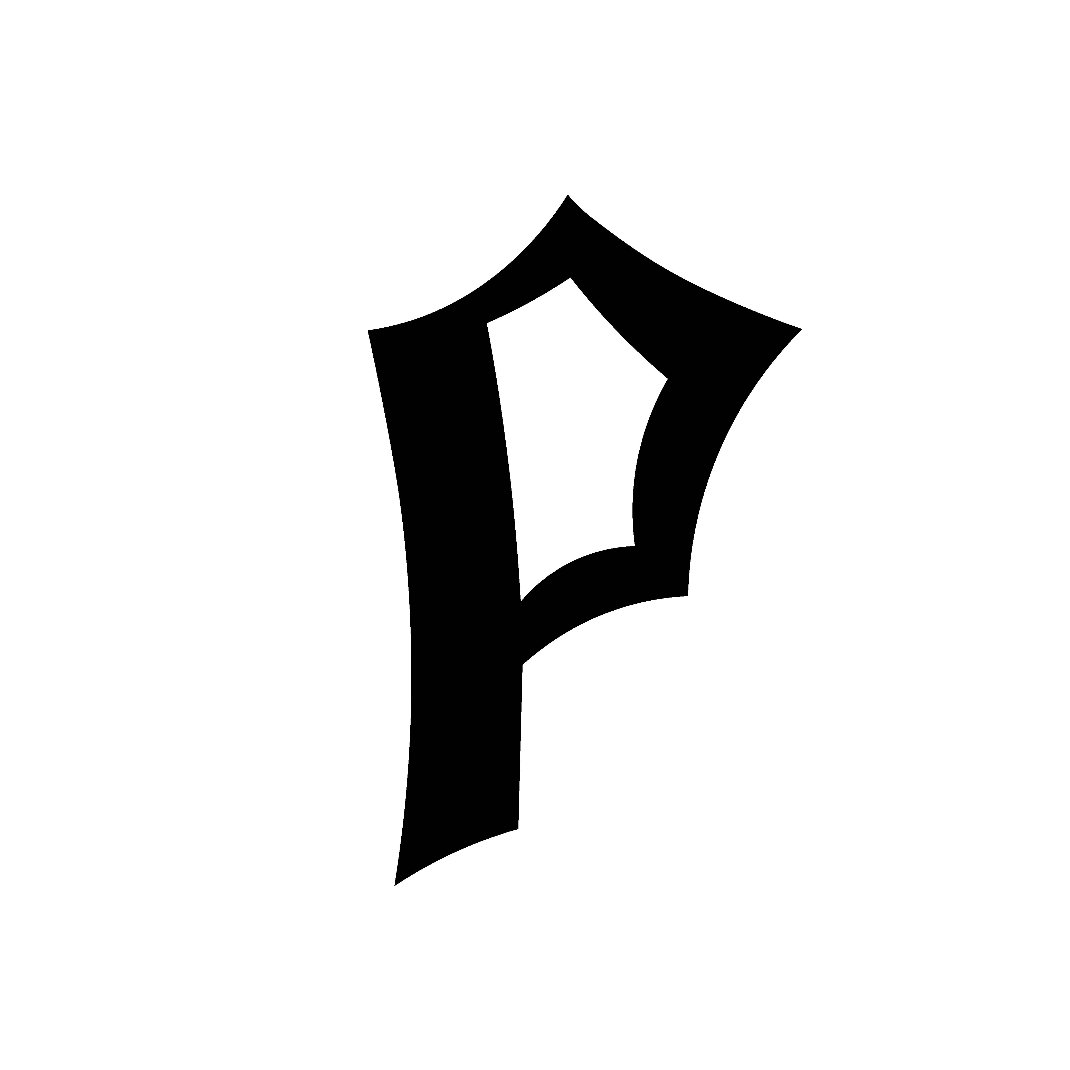
|
| Fig 11.6 Final Letterform "P" JPEG (24/09/2023) |

|
| Fig 11.7 Final Letterform "F" JPEG (24/09/2023) |

|
| Fig 11.8 Final Letterform "I" JPEG (24/09/2023) |
Poster
Upon completing the letterform, we have to make a movie poster using the same visual and letterform.
Requirement:
- The letterform has to interact with the visual
- The size is 1024px X 1024px.

|
| Fig 12.1 Initial Movie Poster Composition (15/09/2023) |

|
| Fig 12.2 Movie Poster Draft 1 (15/09/2023) |

|
| Fig 12.3 Movie Poster Draft 2 (24/09/2023) |

|
| Fig 12.4 Final Movie Poster Draft 3 (24/09/2023) |
Final Outcome

Honer Talents Competition
Research
The two version of the Origin of the Moon Cake
festival story
Ver 1:
- Hou Yi shot 9 suns among 10 suns.
- Hou Yi received an elixir of immortality from the Queen Mother of the West as reward for saving people.
- Hou yi don’t want to be immortal without his wife.
- Pang Meng steals the elixir of immortality when Hou Yi is not home.
- To protect the elixir Chang’e drank the elixir.
- Chang’e become the Moon Goodness
Ver 2:
- Hou Yi and Chang’e are immortal living in heaven.
- Jade Emperor 10 sons turn into suns.
- Hou Yi shot 9 suns among 10 suns.
- Jade Emperor angry at Hou Yi, he was turning mortal as punishment.
- Hou Yi meets the Queen Mother of the West for the elixir.
- Hou Yi keep the elixir and warn Chang’e not to open the case when he is gone.
- Impatient, Chang’e drink the elixir.
- Due to overdose, she landed on the moon instead of heaven.
- Emperor of Heaven gave the rabbit eternal life, and he made the elixir of immortality.
- Queen Mother of the West quest for extra elixir and the jade rabbit broke the one elixir in every thousand years rule.
- The punishment is live on the moon with Chang’e.
- Sunflower – represents good luck and longevity, believed to have the powers of immortality royal eat sunflowers seeds.
- Orchid – represent the unity of a married couple.
- Lilies – represent happiness and good fortune often gifted women on weddings.
- Red – happiness, vitality, long life, happiness, bring good luck commonly used for special occasions like festivals and weddings.
- Yellow – heroism, power, and harmony and Royalty
- Black – Evil, disaster, destruction
- White – Death
- Blue – Immortality, growth, and harmony, health, prosperity, Heavenly Connections, Chinese art often depicts gods, immortals, and other celestial beings.
- Green - Harmony, Wealth, growth
 |
| Fig 13.2 Chang'e References (10/09/2023) |

|
| Fig 13.3 Wallpaper Sketches (10/09/2023) |

|
| Fig 13.4 Moodboard (10/09/2023) |
 |
| Fig 13.5 Artwork Stage 1 (23/09/2023) |
.jpg) |
| Fig 13.6 Artwork Stage 2 (23/09/2023) |
 |
| Fig 13.7 Artwork Stage 3 (30/09/2023) |
 |
| Fig 13.8 Artwork Final Stage (30/09/2023) |
 |
| Fig 13.9 Celestial Binds - Final Overall Artwork (7/10/2023) |
 |
| Fig 13.10 Celestial Binds - Wallpaper (7/10/2023) |
 |
| Fig 13.11 Celestial Binds - Foldable Phone (7/10/2023) |
Design Elaboration
My artwork tells the tale behind the origin of the Mid Autumm festival, the art style was inspired by the Bauhaus movement. It is one of the most influential modern designs showing that I am giving a modern take of an old tale.
The Archer and the 10 Suns:

The sun with branches shown on the left represents the archer Hou Yi. He was known as a hero for shooting down nine suns leaving with only one. The Queen Mother of the West rewarded him with an elixir of life. The subject is inspired by a sunflower, it represents longevity in Chinese culture referencing the elixir of life. The black balls supported by the branches represent the suns Hou Yi has shot down. The color black in the balls represents death and destruction in Chinese culture as it is then when the ten suns wreaked havoc on earth. Although yellow is the symbol of royalty it is also a symbol of Hou Yi’s heroism. And the Chinese character located at the middle of the sun is called “Shuang Xi” which means double happiness. In the Chinese character, it is often seen in weddings ceremony giving good luck to the bride and groom, in other words this Chinese character represent Hou Yi and his wife Chang’e loyalty to one another.
The Moon Goddess and the Jade Rabbit:

The rabbit shown on the right is the jade rabbit. It is responsible for creating the elixir of life, it serves as a companion for Chang’e. Ever since she left earth, she a float up the moon due to the overdose from the elixir of life. Thus become the moon goddess. So, I use the jade rabbit to represent Chang’e. The tear on the rabbit’s face displays the separation from Hou Yi and they will never see each other again for all of eternity.
Symbolism Behind the Background:
 |
| Fig 13.12 Proof of Submission (8/10/2023) |
FEEDBACK
Week 2
General Feedback:
- In the Axis system the contrast of color distracts the readability
- In the modular system don't let the words exceed the unit
- Don't overuse graphical element.
- In the radial system the lines need to be individualize
- Tone down the big graphical element
- In the Axis system the angle the guild line too much
- In the modular system the units are within the margins
Specific Feedback:
- Radial looks wishy washy.
- The line in P in "punk" is out of place in the Axis system.
- The shaped in the modular need to be in the same size.
- Bilateral system is incorrect.
- Dilatational system is OK.
- Gird is good.
- Transitional is good.
Week 3
General Feedback:
- Not held hostage by the shapes of the subject
- Make the letter represent the subject.
- Make sure the set of letters needs to be neither cap nor lower caps.
- Not Recommend using vein of a plant.
- Put tiny branches on the letter.
- Good start
REFLECTION
Experience
I was a hectic experience due to
the fact that we have to rush over the process of the two
exercises in a matter of 2 weeks. Majority of the time I
have no idea of what am doing, and I do admit that, skip
the over the important information in order to get
things done as soon as possible which was not
helpful. But at least the exercise help to challenge me
in the creative process.
Observation
Some part I find it tricky, like of
example understanding the modular system, refining the letter
"A" and "I" and creating the movie poster. After
some useful feedback from Mr. Vinod, I am able to
understand more clearly, and I search on the
internet to understand further. I think I improve as I
experiment with different compositions and techniques. along
the way.
Findings
Reviewing my senior work helps me
a lot when I am stuck on how to start on a certain
task and giving me inspiration for
Typographic system composition and showing a step-by-step
guide on how to create my own font.
FURTHER READING

All designs are based on eight structural systems.
Axial System, Radial System, Dilatational System, Random System, Grid System, Transitional System, Modular System and Bilateral System
The circle and composition. The circle in the restrained-on size, one weight compositions is a tool to guide the eye to create a picot point.

Nonobjective element. It sharpens and articulates the composition.

Constraints and Options
All lines of the message must be used in each composition. Lines may be broken at will to change a single like to multiple lines.
Line breaks
Lines may be broken at will to make multiple lines

Leading
Leading can be tight to overlapping or wide and airy

Word and letter space
Varying work spacing and letter spacing creates textures.

REFERENCES
Fig 4.6:
Pinterest. (n.d). [Artwork posted by unknown artist
Fig 4.10:
Pinterest. (n.d). [Artwork posted by Giorgio Baravalle].
https://pin.it/3Bn7M4C
Comments
Post a Comment