27.9.2024 - 5.1.2025 (Week 1 - Week 15)
Caitlin Ong Lynn Dee / 0343801 / Bachelor of Design (Hons) in Creative
Media
Minor Project
Final Compilation & Reflection
INSTRUCTION
For this module, we suppose paired up into groups. The group must pick a company shown in the Project Brief to design their content. My group chooses Expedio Design.
Group 5 - X-BOARD IDEA SPACE (Expedio)
- Adriena Tan Yan Zi [DA]
- Chan Wan Qing [DA]
- Janice Marie Eng Chia Hui [UI/UX]
- Celeste Low Ly-Ven [UI/UX]
- Jordan Axel [UI/UX]
- Caitlin Ong Lynn Dee [GD]
-
Dow Jia Zheng [ED]
Contextual Research
Interview
After completing the
contextual research, we meet each other on Discord to discuss and list
down questions for an interview session with our client, Toro. The
questions are about the product, brief and the target audience. We consult
with Mr. Mike in order to make further adjustments until it is
finalized.

Fig 1.4 Interview Questions
Data Collection & Analysis
Questionnaires
In Week 3, that is where we created
user personas based on the target audience for the X-board. First, we
created our initial user personas. After that Wan Qing and Adreina design the questionnaires. With the
help of Janice refining the questionnaires, they put them in
Miro to get the final check from Mr. Mike before we put them into
Google Form. The Google is divided into different sections including
demographics, general questions and specific questions for different
groups of respondents.
Interviews
Unfortunately, Mr. Mike told us that data was insufficient,
and we would need to do a follow-up interview. The interview
requires one respondent from each persona. Wan Qing, Adriena and
Janice both drafted the interview questions while Celeste
volunteered to do the interviews due to her extensive connections
(all her friends are working adults).
Once they are done collecting the data form the interviews. Janice,
Adriena and Wan Qing analyzed both the survey and interview data.
After analyzing the data, Janice updated the user personas.
Fig 2.4 Interview Questions
User Personas
Insights, Problem Statements, How Might We
After collecting enough data to create the personas, we moved forward to write down the insight's discovery, problem statements, and “how might we” questions. During Week 6 we meet each other online to list down the issues our target audience might be facing in the top 5 idea section. Those insights are later categorized into key themes.
However, with dozens of issues, it makes it harder to identify the key
themes, so we replace it with ideas to solve the issues according to
what we listed out. Finally, we are able to divide the ideas into
different categories and came out with 3 key themes.
After getting an approval from Mr. Mike, we moved on to the
problem statements and how might we. We first begin by writing down the
points for each category which are user, need and insight. By
completing all three of them, we are able to create the problem
statement. By then we processed to the how might we section. That
is where we created the questions based on the insight
statements.
Ideation
While the others are focusing their own tasks, as for me Janice put me in charge of on creating X-board's logo
Inspiration
I used Pinterest to find inspiration for the
logo
Pinterest board Link:
https://pin.it/32XJ9oFnb
Draft 2
According to Mike our lecturer the first draft is not easily readable. In draft 2, I have decided that certain letter is fuse while the other a separated. The fusion of the letter "o" and "a" forming of an infinity symbol represent that ideas are endless and all of those idea can be put on the board. While the geometric shapes of the letter's "b" "r" and "d" represents the sturdiness of the X-board as well as the company's professional nature.
Final
In the end, everyone picked Monda. And all capital
letters and bold variation is the final outcome for the logo.

Project Proposal
Customer Journey Map
After we finish creating the proposal, we moved on creating
the customer journey map. From completing the customer journey map, we have decided to launch and promote X-board
in three platforms, including social media (Instagram), website and email.
Art Direction
Fig 6.3 Art Direction Slides
Unfortunately, from Mr. Mike commented that our Art Direction is not
detail enough. So, Janice created an extended version of it.

Fig 6.4 Extended Art Direction
Email Design
Type of Emails

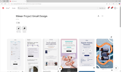
Inspiration
I got all of my inspiration from Pinterest
Pinterest board Link:
https://pin.it/1nKY8ulzo
Sketches
Email Design Draft 1

Email Mockup Draft
Eventually our work is put to a mockup
Email Design Final
I made some minor adjustments to mine designs and Celeste's design to make consistent.
Email Mockup Final
For the first mockup I don't like the background colors blending too much with our email design. So, I change the background pattern and color.
FEEDBACK
Week 7- Draft 1 Logo is hard to read
- Art Direction is not detail enough
- Email Design looks clean and different compared to website and social media
- Lacking black elements
REFLECTION
This module helps me learn how to adapt to people's art style to my own design. And which criticism that is needed to be taken in. Since because I notice that my Team leader Janice doesn't take in my lecturer's comments simply because she doesn't understand it, or it will take too much time on the development.
This module also helps me tolerate with an inactive partner when. Allowing me to take in the opportunities to developed leadership skills by informing her on the latest update on our team meaning.
.png)


.jpg)
%20(1).jpg)


.jpg)
%20-%20Copy.jpg)
.jpg)


Comments
Post a Comment