3.10.2023 - 17.10.2023 (Week 6 - Week 8)
Caitlin Ong Lynn Dee / 0343801 / Bachelor of Design (Hons) in Creative Media
Interactive Design
Project 2
Project 2 / Working Web Page
Stage 3:
I texted Mr. Hamami on the formant he said that there is an issue with arrangement of the footer and suggest a create a border. to see the problem.
Caitlin Ong Lynn Dee / 0343801 / Bachelor of Design (Hons) in Creative Media
Interactive Design
Project 2
LECTURE
Week 9
We learn about CSS code Position.
Week 10
We have learned how to create a webpage for the Project 3
INSTRUCTION
Project 2 / Working Web Page
We are supposed to create a webpage based on the resume prototype from
project 1 and the website must maintain a responsive design
across the different devices.
Stage 1:
I started by writing the content in HTML first, the content is
divided to 6 sections.
I started working on the CCS code for the background color for each
section, arrange the title and profile picture in a row, change the typeface
and group the education, volunteer and work experience content in a row, in
a center alignment.
In the skill section I created the image in Illustrator and
Photoshop, and I recolor the icons in illustrator for the contact
section and education, volunteer and work experience section.

|
| Fig 2.1 Applying Section color. Font Styles and Images (17/10/2023) |

|
| Fig 2.3 Making Icons Black and White in Photoshop (17/10/2023) |

|
| Fig 2.4 Creating the overall progress bar. (17/10/2023) |
The project section is tricky one, I intend to add a carousel but it
difficult as either it messes up the whole entire layout or carousal
itself doesn't function, so I change it to images with link.

|
| Fig 2.5 First attempt of adding a carousel in HTML code (18/10/2023). |

|
| Fig 2.6 Second attempt on adding a carousel. (18/10/2023) |
Stage 3:
I texted Mr. Hamami on the formant he said that there is an issue with arrangement of the footer and suggest a create a border. to see the problem.
_index_border.html.png)
|
| Fig 3.1 Webpage with border (19/10/2023) |
.png)
|
|
Fig 3.2 Fixed element arrangement (19/10/2023) |
Final Stage:
Once I finish the desktop layout started working the layout for
mobile devices. I reference YouTube video and the exercise layout given
in Google Classroom. The transfer to desktop to mobile devices is a
difficult and tedious process, during class I ask Mr. Hamami for help he state that the code I made is too complicated.
_index_Final_Copy.html(iPhone%20SE).png)
|
|
Fig 4.1 Failed Attempt in Responsive Design (19/10/2023) |

|
|
Fig 4.2 Progress on the Media Selector in CSS (19/10/2023) |
Final Outcome
HTML & CSS Link:
Netify Link:
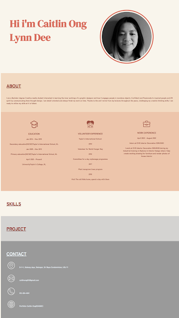
Fig 5.1 Final Layout Desktop & Mobile Formant (20/09/2023)
FEEDBACK
Week 8
- If the image is set at 100%, ii will work on mobile device just like the example we did in class., Set the image width to 100% in CSS.
- On the footer use P instead of H4.
- Add in border to see the problem.
- Font size is too big.
- The mobile looks ok but some extra space on the right.
REFLECTION
Experience
Although the process for doing this project is frustrating to figure out
the rules for CSS code. It is a great experience to learning the
fundamentals of creating a website on my own and how the layout adapts.
Observation
I learnt better by discussing with Mr. Hamimi on my coding and talk to friends. to see what CSS codes,
they use to adapt through multiple devices.
Findings
Since it was my first time adapting my layout to other devices, I always
get frustrated on what I did wrong to the mess-up the lay out. I started
all over again and looked through the website layout given in Google
Classroom. I realize that I complicated the code too much. I then
followed through with the sample codes to rectify my mistakes.


Comments
Post a Comment