7.2.2024 - 14.2.2024 (Week 1 - Week 2)
Caitlin Ong Lynn Dee / 0343801 / Bachelor of Design (Hons) in Creative
Media
Information Design
Exercises
CONTENTS
LECTURE
INSTRUCTION
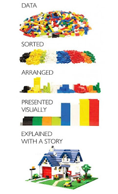
Exercise 1: Quantify & Visualize Data
This Exercise is where we are allowed to pick any chosen item (the content can be buttons, candies, coins etc.). It has to be categorized and present it in an infographic manner. According to Mr. Shamsul the composition must be visually appealing.
|
| Fig 1.1 Visual Representation of Data collection (7/2/2024) |
I have chosen buttons for my data collection. With a total of 102.
ranging from different colors, sizes, and material. Since there total 13
categories. It makes it complicated to figure out how to create a
good composition.

|
|
Fig 1.2 Categorizing all of the buttons (7/2/2024) |
.jpg)
|
|
Fig 1.3 Draft 1 (7/2/2024) |
Mr. Shamsul suggested that we used an existing infographic work as inspiration for our work I search though Pinterest to find the right inspiration.

|
|
Fig 1.4 Infographic poster from Pinterest (7/2/2024) |

|
|
Fig 1.5 Draft 2 (7/2/2024) |

|
|
Fig 1.6 Draft 3 from class (7/2/2024) |
I wasn't satisfied with the result I did in class I create and new
composition. since the buttons I use previously is has too many
categories I decide to only use 5 categories. I use a different poster
for inspiration.

|
|
Fig 1.7 Salmon Infographic from Pinterest (7/2/2024) |
Final Outcome
.jpg)
|
|
Fig 1.8 Final Composition (9/2/2024) |
Exercise 2: L.A.T.C.H
We are tasked to gather data and organize it in the form of an
infographic poster. Additionally, the poster must utilize the
LATCH principles. Which stands for Location / Alphabet / Time /
Category / Hierarchy. The kind of data Mr. Shamsul recommend using
is the Pokedex, FFIV Bestiary, Dinosaur or anything we want. We
have use digital photo editing/illustration software to create the
infographic poster.
Requirements:
- Infographic poster size 1240 x 1750 pixels or 2048 x 2048 pixels
- The data has to be a minimum of 4.
- Pokédex - Pokédex: a database of stats, information and pictures | Pokémon Database (pokemondb.net)
- FFIV Bestiary - Category:Bestiary - Gamer Escape's Final Fantasy XIV (FFXIV, FF14) wiki
- Dinosaur - Dinosaur - Archosaurs, Reptiles, Triassic | Britannica
Sketches
I choose to use Pokémon as my source of data, and I decided to focus
on the Pokémon that lives on the Kalos region. I often look at my senior
work or infographics from the internet as references. I have made seven
sketches to determine the final concept.

|
| Fig 2.1 Illustrations from Pinterest (14/2/2024) |

|
| Fig 2.2 Sketch in class (14/2/2024) |

|
| Fig 2.3 Updated Sketches (14/2/2024) |
Data Collection
- Chesipin - Grass Type
- Fennekin - Fire Type
- Froafie - Water Type
- Mareep - Eletric Type
-
Swirlix - Fairy Type
Wireframe
I selected four sketches to help me limit my options. I created a
wireframe based on the each of the four sketches in Figma.

|
| Fig 2.4 Wireframe 1 (15/2/2024) |

|
| Fig 2.5 Wireframe 2 (15/2/2024) |

|
| Fig 2.6 Wireframe 3 (15/2/2024) |

|
|
Fig 2.7 Wireframe 4 (15/2/2024) |
Revised Data Collection
Unfortunately misunderstand on using LATCH principles to collect data.
So, I have redo the data collection.
Chespin Evolution:
- Kalos / Chespin / Gen 6 / Grass Type / Stage 1
- Kalos / Quilladin / Gen 6 / Grass Type / Stage 2
- Kalos / Chesnaught / Gen 6 / Grass Type / Stage 3
Mareep Evolution:
- Kalos / Mareep / Gen 2 / Electric Type / Stage 1
- Kalos / Flaaffy / Gen 2 / Electric Type / Stage 2
- Kalos / Ampharos / Gen 2 / Electric Type / Stage 3
- Kalos / Charmander / Gen 1 / Fire Type / Stage 1
- Kalos / Charmeleon / Gen 1 / Fire Type / Stage 2
- Kalos / Charizard / Gen 1 / Fire Type / Stage 3
- Kalos / Wailmer / Gen 3 / Water Type / Stage 1
-
Kalos / Wailord / Gen 3 / Water Type / Stage 2
Creating the Infographic
Finally, I pick the first wireframe as the concept of the infographic poster. I rearranged, according to the data I collected.

|
|
Fig 2.8 Revised Wireframe 1 (16/2/2024) |
I search though Pinterest on deciding a color schemes. for the infographic poster. The theme I am going for is either nostalgia or playfulness, to reflect on Pokémon how impact fans from all ages and lengthy history.

|
|
Fig 2.9 Color Scheme from Pinterest (16/2/2024) |

|
|
Fig 2.10 Photoshop progress: Arranging the content
(16/2/2024) |

|
|
Fig 2.11 Photoshop progress: Adding subheading to each Pokémon
(16/2/2024) |
Initial Final Outcome
Once I
finish my infographic I poster send my work to Mr. Shamsul though WhatsApp for feedback. He commented that the legend
and the title should switch places and change the background. For the
background of the poster, I change It a color different color and tone
down intensity of the texture.

|
|
Fig 2.12 LATCH Infographic poster (16/2/2024) |
Final Outcome

|
| Fig 2.13 Final LATCH Infographic Poster (18/2/2024) |
FEEDBACK
- Use the design principles to determine the arrangement the objects.
- Be considerate on how the chart is visually presented to the viewers.
- Sketches 1, 2 and 3 are OK, Sketch 1's concept is overused.
- The arrangement of Final Design looks fun.
- The title of the Final Design can be place on the top for better visual flow.
- The background of the Final Design should be change into something else.
Comments
Post a Comment