6.2.2024 - 27.2.2024 (Week 1 - Week 4)
Caitlin Ong Lynn Dee / 0343801 / Bachelor of Design (Hons) in Creative
Media
Information Design
Filp Topics
CONTENTS
INSTRUCTIONS
Flip Topic 1: Different Type of Infographic & Online Tools
There are many different types of infographics fit for certain type of information. It is important to find the right style to communicate information quickly and clearly.
Individual Task
In our Individual Task we are supposed to pick one online infographic tool given out by Mr. Shamsul to recreate an existing infographic poster which is poorly designed. The infographic tools are Canva, Piktochart, Venngage, Visme, Snappa and Infogram. And we have to review the online tool.
I have decided to recreate this informational infographic all about the American study of yoga in 2016.
Problem of the infographic shown below:
- Inappropriate color scheme
- Too many font types
- Over relied on different color to dedicate different information.
- Too many icons
-
The composition is cluttered leaving with no sense of hierarchy.
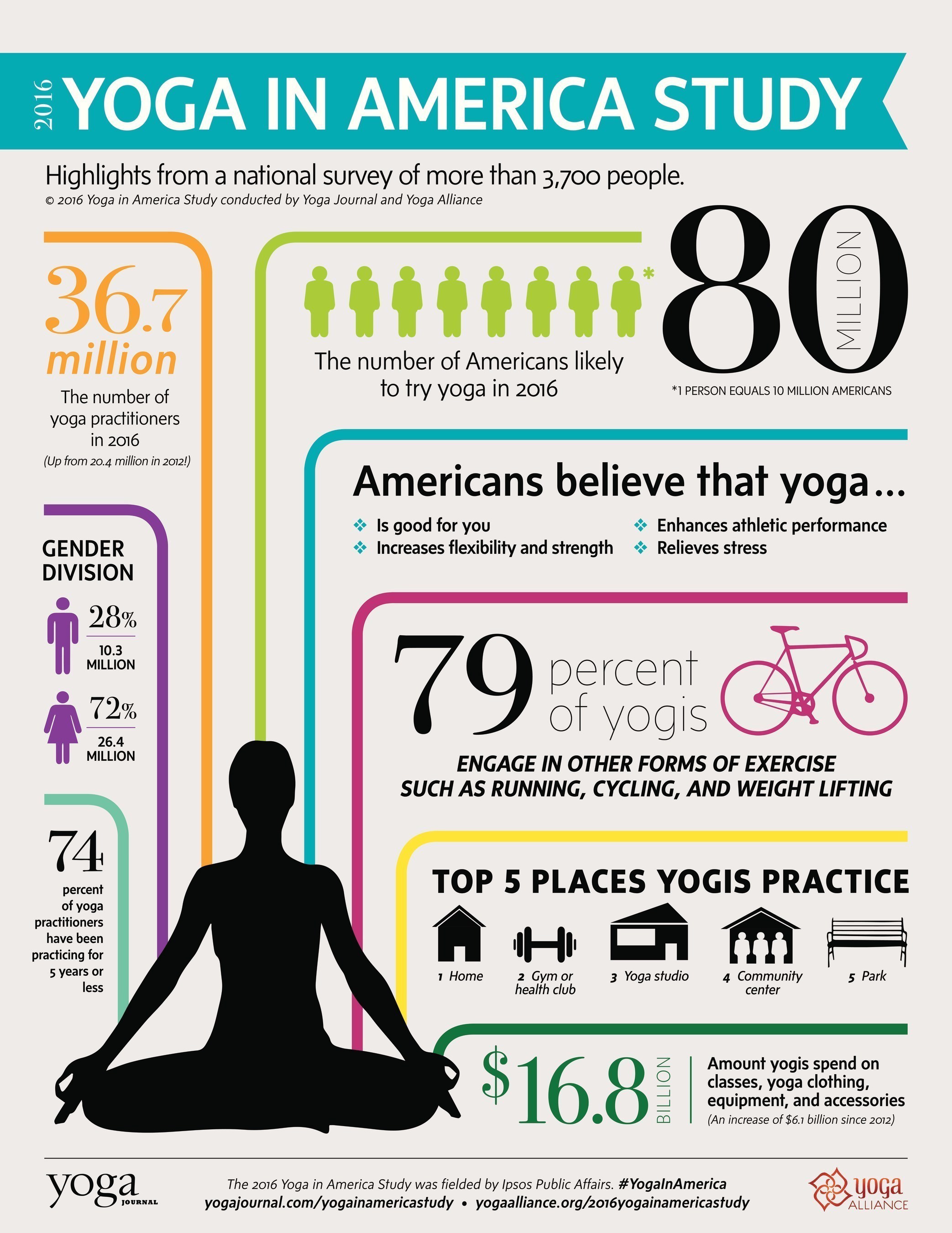
|
| Fig 1.2 Infographic of the 2016 Yoga American Study by the Yoga Alliance (10/2/2024) |
I did research from good Yoga Infographic design
on Pinterest for inspiration and color scheme. The
color scheme that I pick out has subtle and earthy to
make the calm and relax nature of yoga.

|
|
Fig 1.3 Poster about Yoga from Pinterest (10/2/2024) |

|
|
Fig 1.4 Color scheme Samples (10/2/2024) |
I sketch out 3 different layouts and I use Canva to recreate
the infographic. I search through the templates, until I found the right one. From there
I write out all of the information and arrange the
information from the most important to the least important
flowing from top to bottom.

|
|
Fig 1.5 Sketches of layouts (10/2/2024) |
.jpg)
|
|
Fig. 1.6 Canva Template (11/2/2024) |
.jpg)
|
|
Fig 1.7 Final Redesign Work (11/2/2024) |

|
|
Fig 1.8 Redesign Before and After comparison (11/2/2024) |
Canva Review:
Difficulty
I find Canva is very easy to use, the navigation bar's use icons make
it easier to locate all of the design elements, templates and font
types. The share button makes it clear on how to
download my work. There is also icon indication to clearly show how to add
another page or delete a page.
Usefulness
Canva offer templates for any type of document such as presentations,
infographic, resumes etc. So, I do not have go through the
trouble to find another website for a specific
formant. Most importantly it has an auto save
feature, so I won't forget to save my work.
Design templates.
One of the biggest strengths of Canva is that has diverse set
of templates to choose from. But the main problem is that some of the
design templates are not accessible through a paywall, and
some of the design elements are not easier adjustable where
certain elements I can't change saturation, brightness
or color.
Group Task
I was assigned to be in Group 4. Our task is to research on three things.
What to Present:
- The different types of infographics
- The kind of information they're applicable
- An example for each type of infographics.
Flip Topic 2: Saul Wurman's L.A.T.C.H
LATCH is a method used to organize information consist of five principles.
Principles of LATCH:
- Location
- Alphabet
- Time
- Category
- Hierarchy
Fig 2.1 Filp Topic 2 Brief (13/2/2024)
Group Task
What to Present:
- An explanation on the topic
- Provide examples or scenarios of what information best utilized with each principle.
Flip Topic 3: Miller's Law (Chunking)
Originated from the field of cognitive psychology. The term Chunking means the process of taking individual of information (chunks), divided into groups of a larger units. Doing so can improve the amount of information you can remember.
- An explanation on the topic
- Provide an example of how to best utilize this technique in terms of visual delivery for three approaches.
- A well-designed infographic
- UX/UI, web, app, games (screen based basically)
- Processes (you can refer to Project 1 brief as an example or other topics)
Fig 3.2 Flip Topic 3 Group Task Slides (27/2/2024)
Flip Topic 4: Manuel Lima's 9 Directives Manifesto
Information visualization refer to the process of transforming abstract data in visual representation of semantic, this allows the view to easily understand complex ideas. That where we learn about the Manuel Lima’s 9 Directives Manifesto, a set principle that can help us to create an Information visualization.
Manuel Lima’s 9 Directives Manifesto:
- Form follows Function.
- Interactivity is Key
- Cite your Source.
- The Power of Narrative
- Do Not Glorify Aesthetics
- Look for Relevancy.
- Embrace Time
- Aspire for Knowledge
- Avoid Gratuitous Visualizations
Group Task
What to Present:
- Explain the topic.
- Find one example of how-to best display and utilize design for each of the directives.
- Present one good design infographic and one bad design infographic that using the nine directives for information visualizations.
Comments
Post a Comment