8.5.2024 - 1.6.2024 (Week 3 - Week 6)
Caitlin Ong Lynn Dee / 0343801 / Bachelor of Design (Hons) in Creative
Media
Brand Corporate Identity
Task 2
CONTENTS
LECTURE
BCI_4_Brand Ideals
Brand Ideal
"A brand ideal is a higher purpose of a brand or organization that goes beyond the product or service they sell. According to Stengel, "The ideal is the brand's inspirational reason for being. It explains why the brand exists the impact it seeks to make in the world." (Garbe, 2012).
Brand Value
"Brand Value deliver real engagement and direct you toward more powerful bonds with your target audience. For most businesses, brand values act as the "true north" on their compass toward market success; the core brand values remain fixed and steady. It is the part (internal: purpose, personality and proposition) that truly transforms the relationships you build with your customers.
The best brand value example works because they are reflective of customer ideology, but they still embrace the passion of the business in question." (Couchman 2017)
Brand Ideal Part 2
"Ideals are essential to a responsible creative process, regardless of the size of a company or the nature of a business," They are as follow:
- Vision
- Meaning
- Authenticity
- Differentiation
- Sustainability
- Coherence
- Flexibility
- Commitment
- Value
"Vision: A compelling vision by an effective, articulate, and passionate leader is the foundation for the best brands" (Baber, 2008)
"Meaning: The best brands stand for sorting - a big idea, a strategic position or a defined set of values." (Baber, 2008)
"Authenticity: Authenticity is not possible without, and organization have clarity about its market, positing, value proposition and competitive difference"(Baber,2008)
"Differentiation: Brands always compete with each other within their business category and, at some leave, compete with all brands that want our attention, focus and loyalty" (Baber, 2008)
"Sustainability: Sustainability is the ability to have longevity in an environment in constant flux and characterized by future permutations that no one can predict" (Baber, 2008)
"Coherence: Whenever a customer experiences a brand it must feel familiar and have the desired effect" (Baber, 2008)
"Flexibility: An effective brand identity positions a company for change and growth in the future. It supports and evolving strategy." (Baber, 2008)
"Commitment: Organization needs the ensure all people engaged with the brand have complete motivation and dedication in order for it to succeed (Baber, 2008)
"Value: Measurable result need to be created that promote and sustain the brand (Baber, 2008)
BCI_5_Positioning
Positioning
"Put simply, brand positioning is the process of the positioning your brand in the mind of your customers. Brand positioning is also referred to as a positioning strategy, brand strategy, or a brand positioning statement."
What are the different types of positioning strategies?
- Arm Wrestling - Trying take down the market leader and it still possible to take them down even there is no clear leader unless you have a well-established market.
- Big fish, smaller pond - It is where you focus on a niche market within a larger market
- Reframe the market - This style refers to the brand positing reframes an existing market in new terms
- Change the game - This is when there is no market category for what you do. You are the first to invent your own market
So how do you determine positioning?
A position strategy is where you identify how does your brand differentiates with the competition
Positioning in the Marketplace
According to Brueno (2019) There are 7 key steps to effectively clarify your positioning in the marketplace:
- Determine how your brand is currently positioning itself
- Identify your direct competitors
- Understand how each competitor is positioning their brand
- Compare your positioning to your competitors to identify your uniqueness
- Develop a distinct and value-based positioning idea
- Craft a brand positioning statement
- Test the efficacy of your brand positioning statement
How to create a brand positioning statement (Beuno,2019)
There are four essential elements of a best-in-class positing statement:
- Target Customer: What is a concise summary of the attitudinal and demographic description of the target group of customers your brand is attempting to appeal to and attract?
- Market Definition: What category is your brand competing in and in what context does your brand have relevance to your customers?
- Brand Promise: What is the most compelling (emotional/rational) benefit to your target customers that your brand can own relative to your competition?
- Reason to Believe: What is the compelling evidence that your brand delivers on its brand promise?
INSTRUCTION
Task 2A / Research & Analysis
In this task we have to collect 28 logos. We have to define what type of logo, describe the graphic elements or color schemes for each logo.
Task 2B/Logo
In order to create a brand logo, we have to list down a minimum of three career options and think of a brand name and rationalize it. We also have to answer five questions.
5 Questions About Carrer opinations:
- Your career / business
- What service(s) / product(s) are you providing?
- How do you differentiate yourself from others? (uniqueness of career)
- Who will be interested with your product(s) or service(s)?
- Name & Rationale
Career Options
I have list four career opinion out of all
of them I pick the fourth option which is sell products to help people
sleep better.
In preparation for week 3, we have to create two pages of logo sketches and have made two type of logos wordmarks and mascot logos. I also created two mind maps that indicates all of the information about the business.


Sketches & Mind Map Updated
After reviewing our logo sketches, we are required to create
updated versions of our sketches. Since sketch 6 from the draft
version is well received, I decided to expand more on this
concept as well with the typeface of the wordmark. I experimented
to creating different shapes for the body and applying typestyles
that fit with the mascot design. From the feedback given from Ms. Lian, I expanded the mind
map.


I have made three digitized versions of the logo. The first one is direct copy from sketch 6 from the sketch drafts (Fig 2.7), I created the head only because the whole entire body can be distracting, and it makes it easier to applied to small applications. For the font design it to be monospace and rounded to provoke a gentle vibe.


For the second logo. it is based on sketch 16 from the updated
logo sketches (Fig 3.4) but this I tried to make it look original
as it was directly taken from a sample I found on Pinterest. As
for the head I tried to make its shape appear cloud shape. I also
tried creating a custom font, but I ended up modifying an existing
serif font.


The third logo is based on sketch 5 in the updated logo sketches
(Fig 3.3) as for the font I modified a San serif font to made
appear thicker.


Finalizing
Based off sketch 6 from logo sketch draft page (Fig 2.7) I use
some of the pictures I found in Pinterest as inspiration to
redesign the dog. I made the dog little bit fatter and simplify
the shape of ears and tail and making the head more poofy to
appear cuddlier.


Ms. Lian posted a template for the submission, and we have follow put the logo under a various of categories
- Logo in BW, reverse & color
- Logo space rationalization & clearspace
- Logo with strapline
- Logo with rationale (brand ideals)
- Logo minimum size
- Brand primary & secondary colors
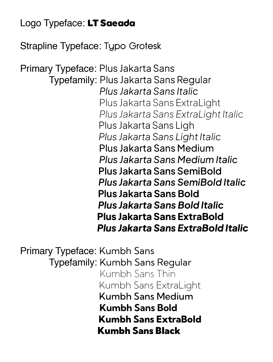
- Logo/brand typeface(s)
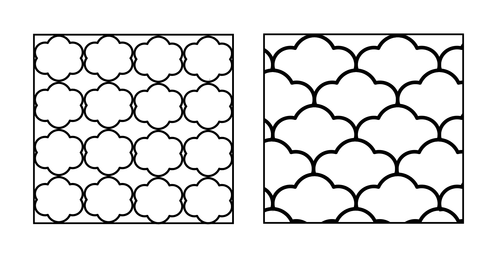
- Patterns derived from logo
- Logo animation (GIF)


For the animation I decide to give the sleeping "Z" effect on the dog


FEEDBACK
- Career Option 2 is out of the question because the target audience cannot see the designs of the logo and the products
- Career Option 4 is a great idea
- Expand on the Target Audience
- Write about the Poodle on the Brand Name Mind Map
- Explore on Sketch 6 and incorporate words on to it
- Change standard of behavior associated to the brand
- Brand name mind map expand the concept of dreams
- The sketches of the of the dog lost the charm from the original
- Explore the dogs body portions
- Sketch 5, 8 and 14 has potential
- Sketch 13 look like a pet store
- Geometric shapes don't suit the logo
- Stick to the original sketch
- More supportive and directive exploration needed to support the three outcomes
- Cannot discern if the out of the three version of the logo is best iterations as there are no exploration to support these outcomes.
- the best idea is version 02 only because the cloud form as the dog’s head is visible
- The filled in area creates texture that at the moment is well balanced with the choice of typeface for wordmark
- Can explore the filled in area (what if it was left as unfilled? Could the construction lines for nose and ear add cloud like fluffiness without being filled in?)
- Go back to your first sketched cloud dog and try to visualize that idea digitally.
- Explore the arrangement of the wordmark typeface with two forms of the dog (dog head/whole dog)
- Use the whole body of the dog as an alternative logo
- The color scheme has to muted to fit the sleepy vibe of the brand
- Like the color scheme white, orange, light blue and light green color scheme and the blue and brown color scheme.
- Use the logo type face for the Rationale
- Switch from pt to mm
- Experiment the typeface using Lorum Ipsum
- Pattern's design is too loud
- Make a GIF using the components in the design
- Show a grid to show construction of the logo
- Make construction lines grey
- Make the eye be constructed with the circle
- Some inaccurate in identifying the types of logos chosen
- able to pick out the various aspects of logo design such as color, typography and graphic elements
- able to pick out the various aspects of logo design such as color, typography and graphic elements
- There should be three version of logo in reverse and logo in color based on three iterations of logo in black and white
- Second logo space rationalization is not as detailed as first (can include measurement as indicator of variation in scale, proportions etc. like in first version with the circle grid
- Space rationalization for wordmark is misleading in that the wordmark may not always be this size (minus 1mm does not translate as a proportionate reduction)
- Logo clear space is correctly indicated, perhaps there are too many markings (4 is generally enough: one on each side)
- Where does the typeface for brand rationale come from? (It’s nice but not indicated as your logo/brand typefaces)
- Check pictorial brandmark minimum size indication (should be 10mm instead of 2mm)
- Potential for wordmark to be even smaller.
- Commendable effort in showing how the brand colors can be utilized as well as typesetting your brand typefaces for display.
- Be careful with the dog’s nose element because in some aspects of logo design presented, it is visually round rather than a square with rounded edges (logo with rationale, logo minimum size) while appearing more square (rounded edge radius reduced) on patterns derived from logo
- Both wordmarks to be dropped together first before the pictorial mark in GIF
- Overall, good design but do some minor adjustments to improve the overall presentation
REFLECTION
Experience
I find the experience hectic and frustrating when we are required to drawn an updated version of the logo, I find myself in an art block since the original sketch is so well-revived, I find it hard to come up with different options. I also struggle with 28 logos slides because doing descriptive is one of my weak points.
Observation
When I draw more of the sketches, I sometimes begin to see the clear picture even some of the sketches are rejected.
.
Findings
As I was look for inspiration on Pinterest on dog logos it helps me give me a clearer picture one how creates the final design for the logo. That includes the help of Ms. Lian's feedback on what am I missing on.
Comments
Post a Comment