29.5.2024 - 28.6.2024 (Week 6 - Week 10)
Caitlin Ong Lynn Dee / 0343801 / Bachelor of Design
(Hons) in Creative Media
Brand Corporate Identity
Task 3
CONTENTS
LECTURE
Visual Culture - Malaysia School Emblem
- Visual culture – ideas, customs of social behavior
- School emblem - badge (worn on a person)
The public-school emblem/Malaysia coat of arms is rise from
Heraldry. School emblems nowadays are pseudo heraldic, meaning they look heraldic,
but they do not conform to the practices to heraldic and they are not easily remembered as
they are complicated.
Some problems with school emblems in Msia:
- Rule of tincture violations
- Use of written text in the coat of arms
- Use of scrolls to write school name in place of the motto
- Poor crafting
- Lack of unity in design
- Repeated use of the same charge
INSTRUCTION
Task 3 / Positioning & Identity
In this task, it is where we are going to establish our brand to its distinctive identity. Use the logo that we created back in task 2, it can be used as a guide to create a mood board. And that mood board can be used as inspiration to create applications, collaterals, digital presence and environmental graphics.
- Logo Applications
- Business Card
- Letter Head & Continuation sheet (with and without mocked text)
- Envelope
- Invoice
- Collateral
- Four appropriate collaterals of your choosing
- Digital Presence
- Website UI & Social Media
- Environmental Graphics and simulations
Brand Positioning Draft
Ms. Lian give us give a framework on
how to create a brand positioning and I create draft highlighting the
operation of my own company.
To show progression we are required show visual references so Ms. Lian will know if those refences are suitable for the brand

Sketches
We are required to sketch out all of our ideas on design of our application to present to Ms. Lian on Week 7 so far, I sketch out the logo applications, four collateral and the website formant.


Drafts
Business Card
I have done some
research on the margin measurement of a business card after that I draw
the margins before designing it. I wanted for my mascot to be the center
of attention in front of the business card to display a friendly
greeting toward customers. From the draft I have created I experiment
with the colors and composition of the text.

Envelopes
Just like what I have
done to the business cards, I experimented with the colors and different
compositions. The Draft 1 and 2 I created to have a sense of playfulness
to capture my brand. But sometimes I feel conflicted since the layout of
contact information is one most important part of an envelope, so I
created Draft 3 as a safety design.

Documents like a letterhead I find it tricky because the design supposed to be simple but at the same time it has distinctive to reflected on my brand. I use reference a lot of letterhead design from Pinterest, and I used the grid system from InDesign to help my layout my design


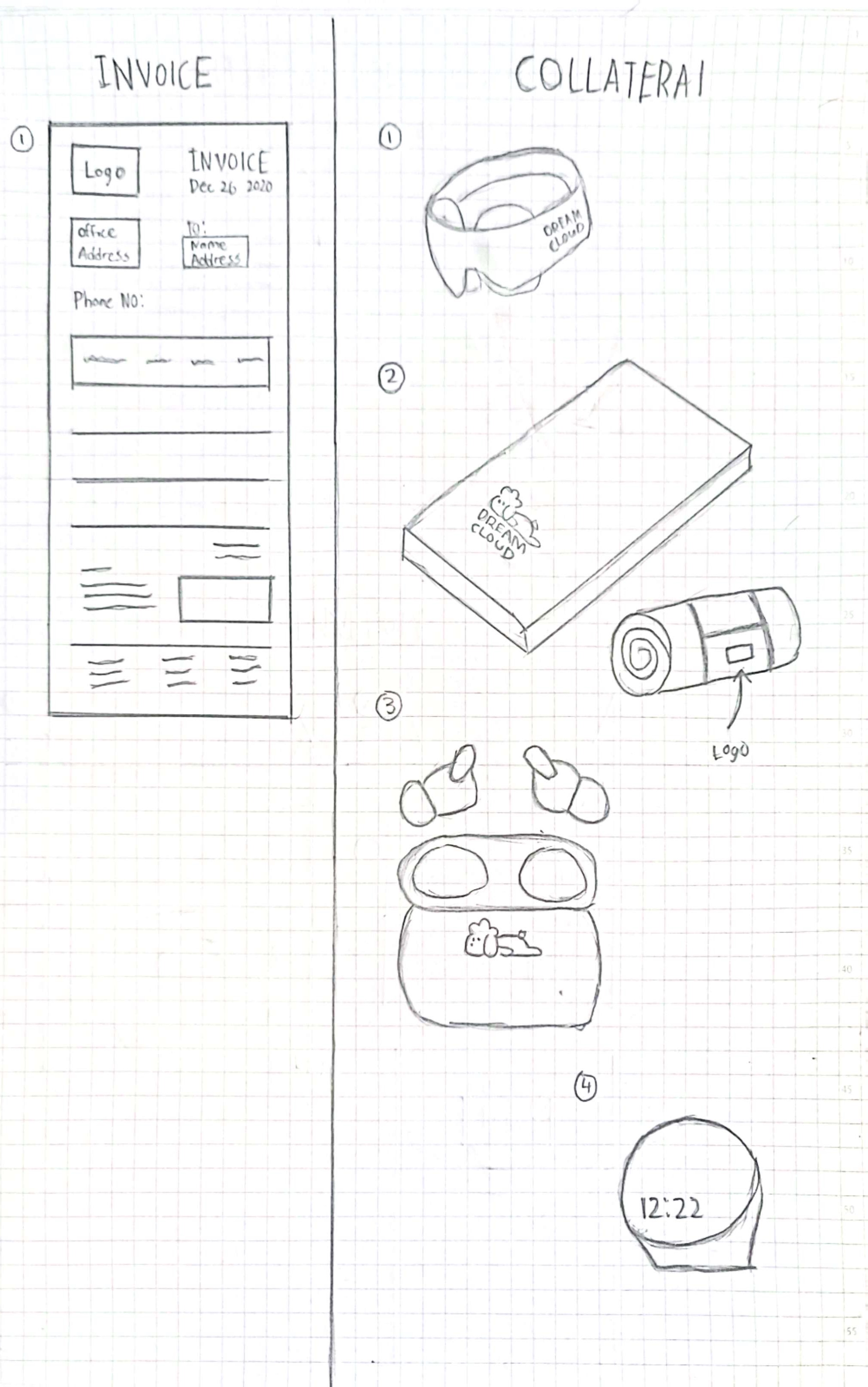
Collaterals
Since my brand sells mainly sells products, the collaterals will be
based on the products. The four collaterals I picked out are a noise
cancelling earbuds, a blackout sleep mask, a self-cooling sleeping mat
and cloud shape clock.


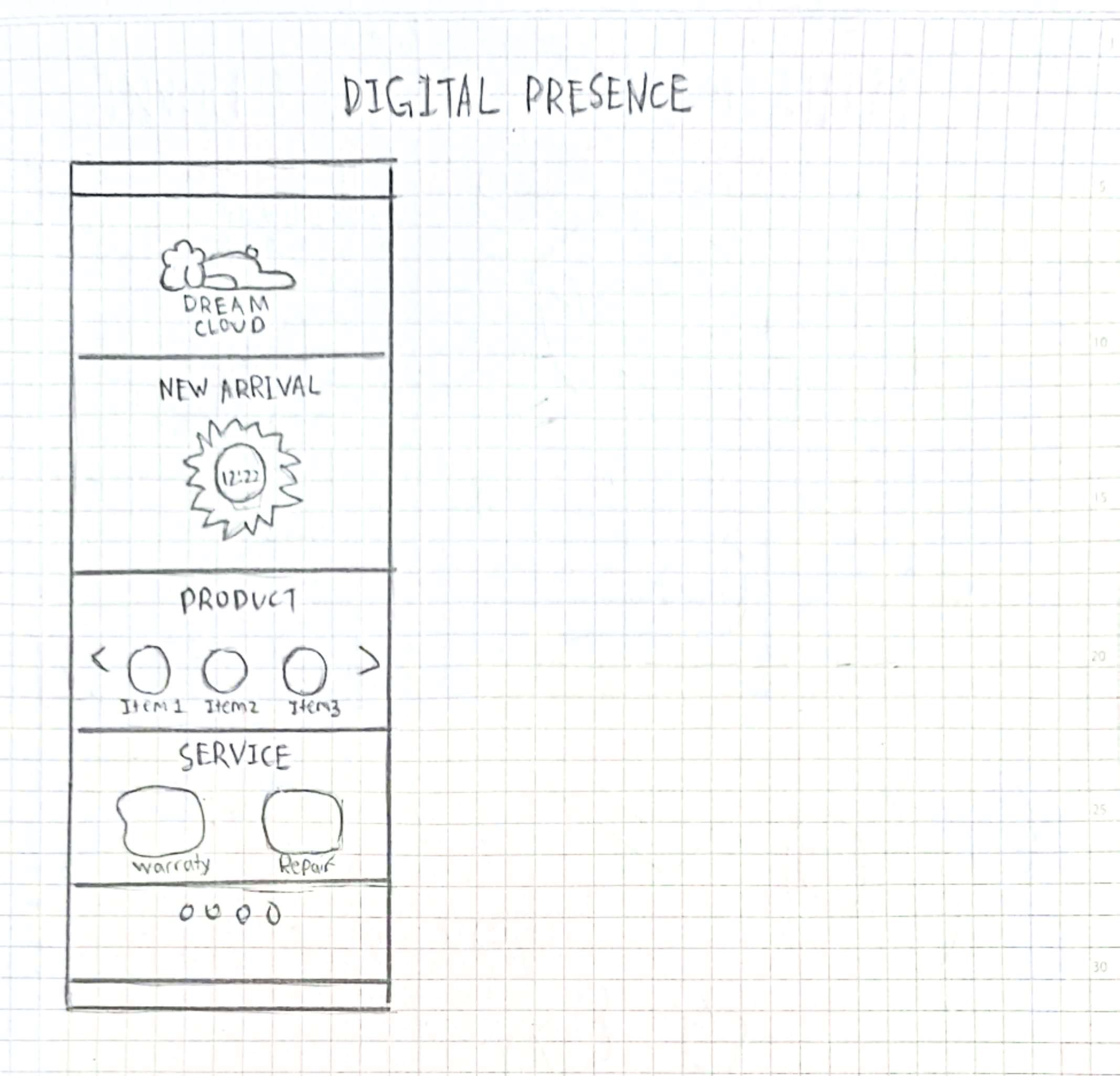
Website UI
I intended for my website UI to be simple in design to reflect the clam
and peaceful vibe of my brand. I often struggle on making the website
aesthetic pop due to the limitation of color and font style from the
logo's visual guidelines that I made back in Project 2.
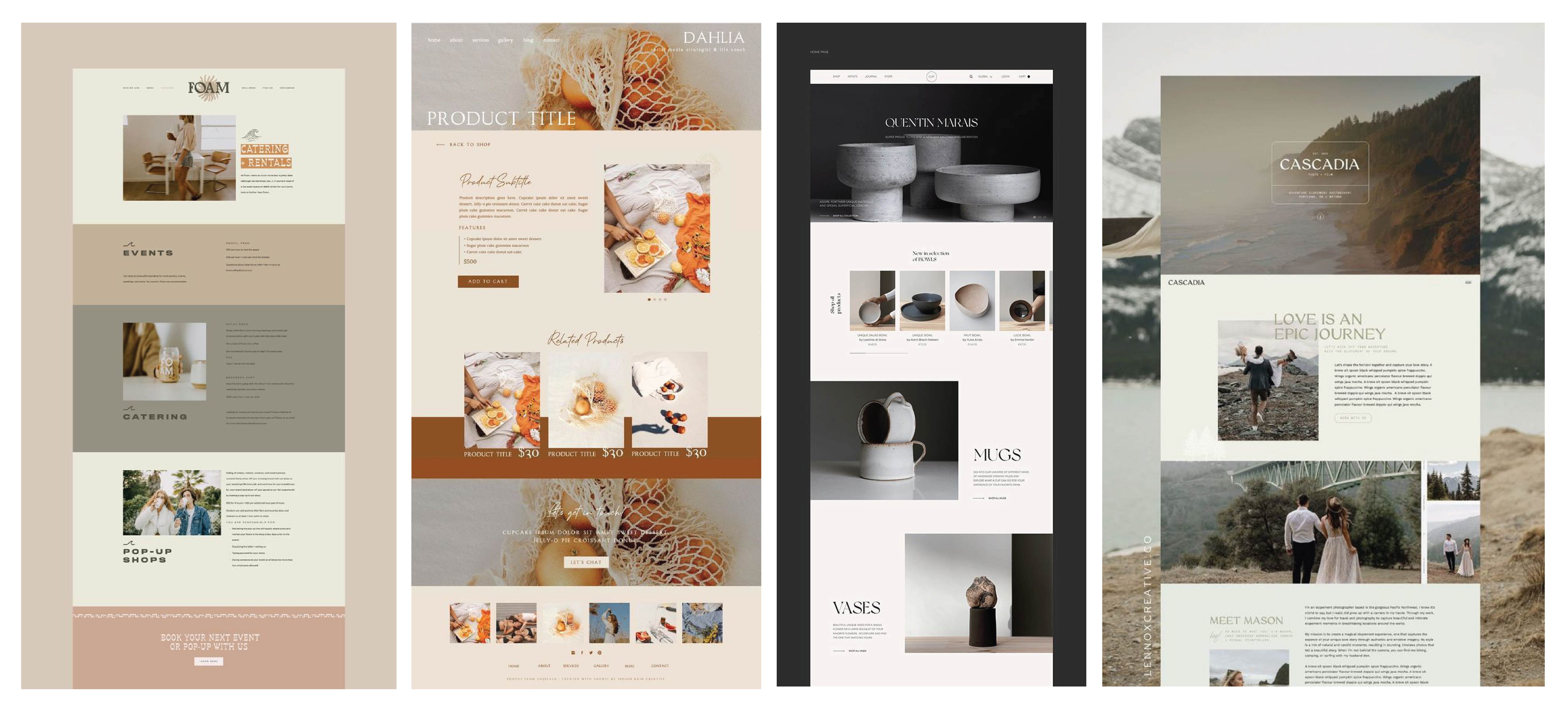
I created a draft for a layout for the Instagram Illustrator but at the moment the draft I create to not suitable design for marketing.

Fig 7.3 Instagram Grid Visual Reference from Pinterest (22/6/2024)

Environmental Graphics
While working on the designs for the billboard and kiosk I have no
idea, how to advertise my brand, so I made several different types of
designs with two different types of concepts.
Taking inspiration from the Doller Shave Club's marketing approach and the Be Stupid campaign by Diesel. The advertisements for my brand will have a playful concept to grab people's attention.
The first concept is the ground approach where I showcase a picture of
a related able topics with the addition of funny tagline. The second
concept is linked towards the idea had in mind in back Task 2. The
billboard will have an ethereal aesthetics, compared to the first
concept it gives off a more positive message.


Finalizing
So far majority of the design application I have done I most well received by Ms. Lian with only a few minor adjustments some of the designs.
For the envelope I research on internet on how the contact information is
laid out. But I wasn't happy with the results, as the design come across
as looking like an ordinary envelope. From the feedback I receive from Ms.
Lain the Draft 3 is the mostly candidate to be the final. So, I sick to
that plan.


Final Outcome
Brand Poisoning
Artwork
FEEDBACK
- The business card of Sketches 1 & 3 is acceptable, and Sketch is unacceptable because it is cropped out
- The letter head reference doesn't fit with the brand
- In Sketch 2 Envelop don't put the logo on the front because that is where the address information comes from
- Invoice Reference is suitable for the brand
- Find out where to put the logo on the clock
- Mission and Vision statement are mix up
- Expand different sector of the target market
- Expand Brand positioning statement
- Look at the career options again to find out what is the unique selling point
- The round tab in the business card is not relevant to the business design, suggest using the dog nose as the tab
- Draft 3 for the envelop design is acceptable unlike the other two it has enough space for the contract information
- Prefer Draft 1 of the letter head, remove the line to prevent from looking too ridge. Use the same footer design as the Invoice
- Good design on the Invoice
- Good design on the Collateral
- Good design on the Website
- Both design direction is acceptable for the brand but looking at the website the second approach is the best
- Put photographs on the Instagram page
- Slight overlap of vision and mission. First sentence of mission is a rehatching/rewording of vision. Half of first sentence of vision as well as second sentence are more accurately conceptualise as the mission. Missing psychographic segmentation of targeted audience. Room for improvement in the conceptualisation of brand value to not represent what the business can offer but what fundamental beliefs the business holds on to. Inaccurate brand positioning statement (focusing on sustainability) when product provides aid for quality sleep (what it offers, to whom, USP). Identity system not to be kept as separate slide but to be incorporated into positioning slide as second section (after brand positioning and before visual references). Fail to include sketches with visual references (also did not submit sketches under progression). Do credit your resources accordingly. Incomplete submission of artworks (missing website and collateral). Demonstrates sensitivity to type (especially visible in corporate stationery). However, the bounding shape for wordmark on namecard should be derived from the brand identity instead of adapted merely because it suits the space more. Mayhap, header typeface utilised on environmental graphics and social media could be adapted unto the website (especially on the landing page to create the same impact). Otherwise, applications designed are quite cohesive in that they manage to reflect a consistent brand identity throughout.
REFLECTION
Experience
It has been a hectic experience as we were required to turn the mundane office paraphernalia into a branding exercise creative design. I felt as if I shot myself on the foot as this task was a follow up to the guidelines and procedures set in Task 2.
Observation
I spent my time making observations on the work of my peers to see if I was on the right track. By looking and through the work of my peers it has helped me gain inspiration on my design application.
Findings
My inspirations for my design application mostly came from looking through Pinterest. During my conversations with Ms. Lian, I realized that some inspiration from Pinterest could sometimes be taken out of context. I always do research on the measurements of the margin line for the office applications.
Comments
Post a Comment