5.11.2024 - 17.12.2024 (Week 7 - Week 13)
Caitlin Ong Lynn Dee / 0343801 / Bachelor of Design (Hons) in Creative
Media
Creative Brand Strategy
Task 3
CONTENTS
LECTURE
Creative Brand Strategy | Task 1
INSTRUCTION
Task 3: Campaign Branding
This Task is a continuation of Task 1 and Task 2
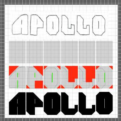
Logo
I started on creating the logo I had an idea to give a more futuristic look yet retro look I eventually I started to expand my ideas. Until I finally got the look that I wanted.

Fig 1.6 Logo Idea 5 digitalized Process Refined Ver.
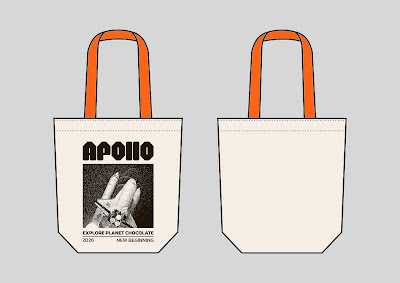
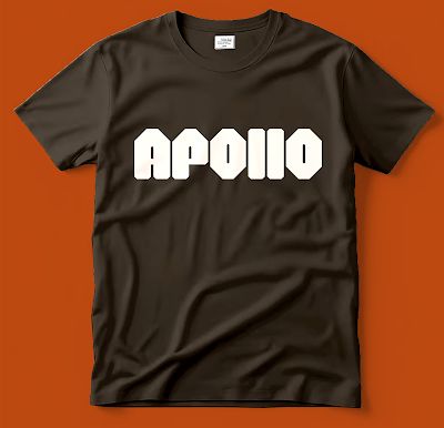
Offline Touchpoints Progress
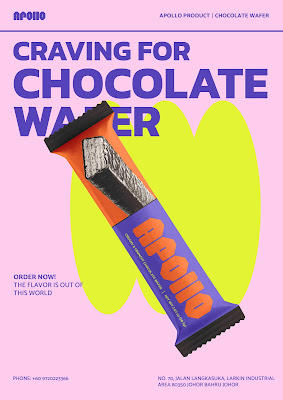
Products
I wanted to redesign Apollo's wafer, stick wafers, and layer cake I the
designs for the packaging itself was tricky because I had no experience on
creating the packaging artwork and I don't know how to make it look cheap at
the same time modernized the graphic
 |
Offline Touchpoints Progress
Caitlin Ong Lynn Dee (@space20032024) • Instagram photos and videos
For website I have made couple of wireframe draft to determine which format is best suited for the aesthetic of the rebrand. Ms. Lian prefer Draft 2. Overtime I had some difficulty on integrating the graphical elements without being to be distracting at the same time maintaining consistency with the other touchpoints
FEEDBACK
Logo:
- For the logo consider option 3 and 5
- Option 1: the logo looks standard
- Option 2: the A looks off
- Option 4: it looks like some fruit
- Put the mobile pop-up design in a render mockup
- The packaging design looks too similar to the original
- Think about what type of content to put in the poster
- For the collateral refer to graphic element proposed in Task 2
- Consider what type of format to put on the website is a page-to-page website or a scroll down website
- For Option 3, go with the diverse version
- Option 3 diverse Ver: it has potential to give a contract to the visual style of the brand. Use it to play around the brand color scheme
- The blocky Ver of Option 3 is acceptable
- Create an artwork for the packaging first both front and back. Then put it into a mockup
- Utilise the brand colour scheme
- 1st design of layer cake packaging look expensive it might stray away from the original audience
- The strawberry illustration doesn't fit the overall look of 1st design of layer cake packaging
- In 2nd design of layer cake packaging a lot of design elements are fighting for attention
- 2nd design of layer cake packaging has an interesting way of display product flavor
- The wafer packaging design is fit the affordable look of the brand
- In the wafer packaging design replace the wafer illustration to a bitmap image of the wafer
- Good uses of font
- Make the packaging design consistent
- Utilities other colors as the base color other than white to prevent it from looking clean
- Use the box format for the visuals
- As the visuals in the wafer packaging remove the color to be consistent with the others
- Draft 2 is better because it utilized the brutalists aesthetic
- The other draft look like any other website format
- All of the merchandise looks good
- Draft 1 of the T-shirt doesn't represent the aesthetic rebrand
- Like the moon texture in Draft 2 of the T-shirt and don't put the outline as it does not present in the logo
- Packaging design is good to go
- Good use of color
- Add in a post including the brand tagline
- Giveaway post is weak the do a caratal post with one displaying information the next include the giveaway
- The Q&A post add a follow up display information about the Q&A Session
- Add in a scene showing the tagline
- Show the contact information in the end
- Add in description about the campaign in the landing page
- The Logo looks small
- It looks good
- Consistent with the website UI
- Don’t crop out the products in the shop link section
- Don’t need to show merchandise
- Bring back the shot the said “Explore a New Brand of Flavor” and “Venture Toward the Unknown
- In the Product Reveal section slide it horizontally so that way people can see the whole entire packaging of the product. Don’t crop it
- Good utilization of the Brand Color
- Add in Website in the end
- Good Design
- Good but rearrange the logo in the poster
- Delete the colon in Destination: Andromeda
REFLECTION
It is a tough experience throughout the task we are supposed to manage ourselves on the creating each of the touchpoints. Majority of the time I was overwhelmed on keeping track on the consistency of the art direction. I felt that I was too overly ambitious in Task 2 that I screw myself a lot into this task. One minute I finally create a good design for one of the touchpoints. but it backfired because it didn't suit the objective and purpose.
The art direction I was going for brutalism I propose it because it is an aesthetic that appreciated the raw and unrefined and I though it reflects the old legacy of Apollo. Overtime I struggle to use it because this type of style in art design has a lot of freedom to it. On the other hand, branding aesthetic is very restricted. So, I have dilemma on how to incorporate a free flow style to a brand framework.


Comments
Post a Comment