During Illustration and Visual Narrative Class we had an Sharing
Session with Low Hsin Yin is a type and graphic designer from
Malaysia
Title: BARANG² SENDIRI S’JA – Commercial Vehicle Labels in
Malaysia Date: 2 June, 10am
Fig 1.1 Poster of Sharing Session
Low Hsin Yin studies the font of commercial vehicles
She interviewed with 3 signwriters
The Wong Brother
Mei Juan
En Nasharaddin
Wong Brother:
Use Enamel paint and a brush to draw the font on the
truck
Do it in 20 minutes
It doesn't matter if mistakes are maded
Use tape to measure the height of the fonts
Mei Juan:
Works at Father bussiness
Pratice it by repeating the word
En Nasharaddin:
Use a perment marker
Use a tape to measure the height of the fonts
Styilstic Factors
Writing over tapes; within or without tapes
skeleton proportion
slanted axis
composition
combination of different writing styles
D-I-Y
Skeleton, proportion:
Squarish/Groteque
Angular/Almond
Oval Rounded
Composition:
Left Alignment
Centered
Modern Way:
Digital Reckoning
Lettering styles were not strictly regulated.
INSTRUCTIONS
TUTORIALS
Video 1: Typo Task 3A Typeface Construction (Shapes)
Video 2: Typo_Task 3A_Illustrator To Fontlab5 Demo (WATCH FIRST
before FontLab 7 Video)
Video 3:Typo_Task 3A FontLab7 Demo (Watch FontLab 5 Demo First)
Video 4: Typo Task 3A (optional) – Preview & Type Your Font on
Blogger by Lim Jia Sheng
Task 3: Type Design & Communication
Practice
In week 7 class we bring 5 different writing tools and a graph paper in
class, instructed by Mr. Vinod on Facebook. We have written diagonal, horizontal,
vertical, and circular lines in all 5 writing tools in 5 different way
This includes the letters AOTMX.
Fig 2.1 Whiteboard Instructions (16/5/2023)
Fig 2.2 Writing Exercise (16/5/2023)
Exploration
During week 8 Independent week we have to do the same content of
the writing practice in that we have done in week 7 class but this
time we have to do it differently.
Instructions:
Writing
diagonal, horizontal, vertical and circular lines for all
5 tools in 5 different ways for each too
Writing AOTMX
for all 5 tools in 5 different ways for each tool
Select 1 option from the 5 different options from each tool and
write the letter’s “a e t k g r i y m p n” in the selected
style.
We can choose either Uppercase or Lowercase to write on it.
Fig 3.1 Writing Exercise with a Artline 210 pen Nib Size: 0.6
(21/5/ 2023)
Fig 3.2 Writing Exercise with White board pen (21/5/ 2023)
Fig 3.3 Writing Exercise with a Lettering Pen (21/5/ 2023)
Fig 3.4 Writing Exercise with Fine Line Pen Nin Size: 0.3 (21/5/
2023)
Fig 3.5 Writing Exercise with a Sharpie (21/5/ 2023)
On week 8, Independent Learning Week, we uploaded our grahy paper
with letters “a e t k g r i y m p n" written in 5 tools
with the chosen options.
Fig 3.6 Chosen style for each written tool. (22/5/2023)
Research
When writing the letter, I must considerate the anatomy the ascender, cap
line, baseline and the descender. I search up on the internet for a
diagram for guidance.
Fig 4.1 Anatomy of Typography (24/5/2023)
Visual Reference
I prefer the words drawn in a lettering pen and sharpie. Mr. Vinod
suggest the lettering pen style, he told me to keep practice it more until
it consistent in style. He provided me website about the foundational hand
to help me make my writing better. Website link Title: 'Foundational Hand (Calligraphy, pt.2)' is on the Reference
Section.
I practice the lettering by the flowing the font shown on the website
given. The uppercase lettering is drawn in a Foundational Majuscule style
and the lowercase lettering is drawn in modernized Half-Uncial style. I
pick the lowercase letters for the digitalization.
Fig 4.2 Modernized Half Uncial Font Reference (24/5/2023)
Fig 4.3 Lowercase Font attempt (24/5/2023)
Fig 4.4 Foundational Majuscule Font Reference (24/5/2023)
Fig 4.5 Uppercase Font attempt (24/5/2023)
Deconstruction of Letters
Analysis of Bembo: I choose to deconstruct Bembo
letter “k” “a” “p” since it is like my lowercase font practice sheet. In
the case of the stroke is started with a skinny straight flat tip. As I
was using a lettering pen with a flat tip.
Unlike other font the shoulders or bowls are started angled
straight line instead of rounded
The arm and the leg of a k is not even the leg is longer.
The terminal of the a is flat instead of round.
The stem serif of the k is not even.
The head serif of the p is bigger that the k and both has a
different angle.
Fig 4.6 Deconstruction of Bembo "k a p"(27/5/2023)
Analysis of Half Uncial:
The seif are varied the k seif is stubby and flat where else the
“p” is thinner and pointed.
The arm of the k is curved compared to the leg.
The stress stroke of the “a” is extremely thin to the point you can
hardly see it.
The letter k has no bottom serif compared to the "p"
Fig 4.7 Deconstruction of Half Uncial "k a p" (27/5/2023)
Digitization
I practice writing the letters to make it is more constant until it looks
like it is part of the font family for digitation.
Fig 5.1 Refine the lowercase letter (27/5/2023)
According to Mr. Vinod Tutorial video we have to use the letters
"Typk" to indicate measurement of the Ascender line, Cap line, Median
line, Baseline and Descender line
Fig 5.2 Measuring the font guildline (27/5/2023)
Requrirment:
The Artboard must be 1000pt x 1000pt.
X-height: 500pt
Measurement:
Ascender line: 733 pt
Cap line: 696 pt
Median line 500 pt
Baseline: 0pt
Descender line: 205pt
From the written letters show in Fig 5.1. I pick one of the best letters
to use as reference for digitalization. I use a calligraphy brush
tool to replicate my writing. Later on, I use the direct selection
tool/ the curvature tool to modify the strokes properly.
Fig 5.3 Comparison of the written letters and the Attempts
of Digitization (3/6/2023)
I modified the strokes to make it slightly closer to Bembo (the
font I analyzed) while still maintain the characteristic of my
writing.
Fig 5.4 Draft 1 of Digitization (3/6/2023)
Refinement
Draft 1
Changes I made after feedback from Mr. Vinod:
I use the loop of a "p" to replace the letter a's loop and the
letter g's loop.
Delete the letter r's tail.
Make the arm & leg of letter k the same size.
Fig .6.1 Draft 1 of Refinement (10/6/2023)
Draft 2
From draft 1 I am not sure how to refine the serifs on calligraphy brush
style. So, I decide switch to using basic shapes to reaccreted the
letters.
Striated strokes:
I use the rectangular to create the shapes.
I made the tip of a rectangular shape pointy to replicate the
angled flat tip in Fig. 6.1
Round strokes:
Technique 1: I use the line tool segment tool to create a curve line
and then I use the width tool to create the stress. Sometimes I
combine shape with the line.
Technique 2: I overlap multiple circles and use the shape builder
tool to fill the spaces.
Fig 6.2 Shape used (10/6/2023)
Fig 6.3 Line segment tool Technique (10/6/2023)
Fig 6.4 Line segment tool Technique outline (10/6/2023)
Fig 6.6 Shape builder Tool letter "e" (10/6/2023)
Fig 6.6 Shape builder Tool letter "p" (10/6/2023)
Fig 6.7 Draft 2 of refinement (10/6/2023)
Draft 3 The shape builder tool doesn't work for
rounded strokes, I change the letter a's g's and p's loops to make it
look cleaner, using the line segment tool. I also change the stem
of the letter a as the rounded stem looks odd by compaction the other
letters. The letter k is one of the most changing letters to get it
right, because the rounded leg and arm as it is not in sync with the
other letters. I change the strokes from rounded to
straight.
As entrusted by Mr. Vinod I created punctuation period, comma,
exemption mark and hostage. The tutorials given in Facebook.
Fig 6.8 Punctuation Tuitional on Facebook
Fig 6.9 Used Shapes (10/6/2023)
Fig 6.10 Draft 3 of Refinement (10/6/2023)
Draft 4
I tried refined the serif to make it more natural. I experiment it
on a letter "t."
How to refine a serif:
Use the regular shapes and position them in 34-degree angle.
Combine the shapes and rounded the edges.
Make the tip smaller.
Serif Experiment:
Ver 1: 34 degrees
Ver 2: 47 degrees
Fig 6.11 Crotructing the serif. (11/6/2023)
Fig 6.12 Draft 4 of Refinement (11/6/2023)
Constructing the Final Letterform
According to Mr. Vinod the top serif is too long so I thought an
angled tip stroke for a serif might fix the problem. I tweak
the letter "a's g's p's" loops upon realize that the stress needs to be
the same thickness as the serif.
From the feedback from Mr. Vinod the leg serif must be the same as the
other letters. After trial and error, I finally able to get the leg and
the arm of the letter k right.
Fig 7.1 Draft of Final Letterform (11/6/2023)
I was unsatisfied with the look of the top serif. I was having trouble
of changing it due the nature of the single-story letter "a" and letter
"g". I analysis the Bembo letters "p" and "q" I and found out the top
serif looks different, which means I can create the top serif without
any problems.
Fig 7.2 Analysis of "Bembo" p and q (11/6/2023)
Top serif creation:
Make the bottom serif smaller.
Align the slope of the bottom serif and the stem together.
Combine them to get her.
Smoothen the conner.
Fig 7.3 Constructing upper serif (11/6/2023)
Fig 7.4 Letterform Dimension (11/6/2023)
Letterform Dimension:
Ascender: 733 pt
Cap Line:696 pt
Median Line: 500pt
Baseline: 0pt
Descender Line: - 205pt
Fig 7.5 Final Letterform (11/6/2023)
Fig 7.5 Final Letterform (11/6/2023)
Evolution of
punctuation
Around on week 10 we are told to design punctuation period, comma,
exclamation mark and hashtag Mr. Vinod gave us a tutorial on
Facebook.
Fig 7.6 Punctuation Tuitional on Facebook (11/6/2023)
I struggle a lot with the punctuation since I cannot find the x heigh
for the punctuation and I begin of development I wasn't aware of the
rules behind it, I ended up making careless mistakes along the way such
as I didn't make the exclamation mark and the hashtag touch the cap ling
or the considering the thickness of the hashtag.
Fig 7.7 Punctuation Evolution (11/6/2023)
Font Lab
After I finalized my typeface, I watch Mr. Vinod's demo video
on how to upload and export our fonts in Font Lab 7. First, I fill
up the font measurements in the family dimension menu for
(ascender and descender). including the font name
information, I name it "Ancient Serif". Then I uploaded every
single letter in their respective slots.
Fig 8.1 Copy and Pasting letters in FontLab (11/6/2023)
Fig 8.2 Character map (11/6/2023)
The next step, I did the individual kerning for each glyph in the
metrics tab as followed in the demo video.
Fig 8.3 Left: Before Kerning: Right: After Kering (11/6/2023)
Poster
We have to create a font poster using the word we design, and we have to
use Deep AI t to come up with our sentence.
Requirements:
Poster size: A4
The poster text must be the same point size.
The credit line must have font name creator name and year of
creation, it must be 12pt using Univers LT Std font.
While make the poster on Illustrator I found out there is error on the
words where the letters overlap with each other, so I made
adjustments on the Kering to make them equal.
Fig 9.1 Kering for poster (11/6/2023)
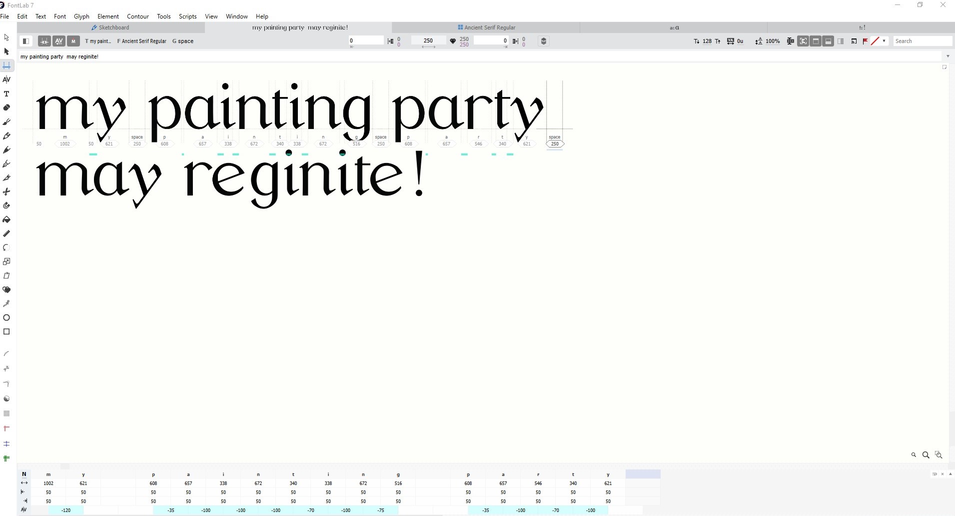
Then I use Deep AI to generate a sentence using limited words,
It is quite difficult to find one since Deep AI tend to give me
words that contains the letters that I don't have. Eventually I ended up
with the sentence "My painting party may reignite your passion, so
grab your moodiest palette and join in!,#". I use the words "My painting
party may reignite" for my poster.
Fig 9.2 Deep AI Result (11/6/2023)
Poster Inspiration
Fig 9.3 Poster Inspiration Credit to Pinterest (11/6/2023)
I made some draft on the posters, and I made some adjustments on
the word's kerning, it was inspirate by the poster I found on
Pinterest shown above. Draft 1I angle it sideway, I made each word
different color and in corporate stripes. In Draft 2 I changed the one
of the letters different colors for each word.
Fig 9.4 Left: Draft 1 Right: Draft 2 (11/6/2023)
I receive feedback from Mr. Vinod, he mentioned that Draft 1 is too
loud and the color change in Draft 2 doesn't convey any meaning. My
friends gave me suggestions to highlight the words "my pain may reign."
to give an impact.
I tried making my words expressive by using the exclamation marks to
form a crown as a pun on the word "reign" within "reignite" word. I even
experiment use the letter i and the exclamation marks to be used as rain
drops, this a pun that the word reign sound like the word rain. but in
the end, they didn't work well. Mr Vinod suggested to stick to the
composition of Draft 2.
Fig 9.5 Drafts After feedback (20/6/2023)
Mr. Vinod help me rearrange the credit line to make the more
balanced and I change the background color from black to dark grey
to make the color scheme more subtle.
Fig 9.5 Final Poster (20/6/2023)
IMPORTNAT NOTE: Updates for Final (25/6/2023)
After I was Kering the word for the poster I realize making the
kerning equal is doesn't look good, so I decided to change
the Kering.
Fig 10. 1 New Kering information for aetkgriympn.,# (25/6/2023)
Fig 10.2 Comparision of the kerning (25/6/2023)
IMPORTNAT NOTE: Updates for Final (26/6/2023)
I notice there is an error in one of the punctuations. the
hashtag symbol looks skinny and out of place. So I use a picture
for reference I notice that the small strokes of the comma and the
exclamation mark need to be the same thickness of the serif.
So, I decided to make adjustments.
And I also noticed that the side baring of "aetkgritmpn" is
wrong, so I fixed it
Fig 10.3 New Side Baring (26/6/2023)
Fig 10.3 Hashtag reference (26/6/2023)
Fig 10.4 Using reference as a guide (26/6/2023)
Fig 10.5 New Punctuation (26/6/2023)
Final Outcome
Font Tester
Screen grab of "New Metrics Window" with sentence
Fig 11.1 Final Kering of aetkriympn .,!# (26/6/2023)
Fig 11.2 Final Kering information for a sentence (26/6/2023)
Fig 11.3 Final Kering information for a sentence
Part 2 (26/6/2023)
Write until you find the letterforms have a consistent look and
feel. They must looks like they are part of a family.
Specific Feedback
suggested the lettering pen style
Keep on practicing until the letters are more consistent
in style
Gave me a website link to help me
Week 9
General Feedback
Make sure to use 1000pt x 1000pt art board; 500pt x-height;
cap line; descender and ascender line; baseline and median
line. Use Adobe Illustrator
Specific Feedback
When using calligraphy brush press outline and use
direct selection to tweak it
Week 10
General Feedback
Refined all the letters.
Specific Feedback
Letter "a" to "r" don't consistent where else letter "i" to "n"
look good.
Terminal for t is too long.
Delete the tail for "r."
The leg and arm for "k" don't look right.
Use the bowl of p to replace it for "g" and "a."
Week 11
General Feedback
Strokes need consistent.
Don't combine the letter "o" with the stem when making a
"p."
Maintain the angle of the stroke for all letters.
Specific Feedback
The upper serif is too long.
the letter y looks good.
The serif on arm and the leg of k needs to be the same as the
stem.
the upper serif needs to be similar the upper serif of the
letter. "i"
Week 12
General Feedback
Use Make type great again in case we cannot find a
sentence
Use Univers LT Std font.
Use a wide variety of letters in a sentence
Font has to be the same point, it has to be bigger
Prevent on using black background.
Specific Feedback
Draft 1:
The Stripes patterns are too loud
Draft 2:
Use Lighten gray.
The multicolored letter doesn't convey anything
meaningful.
Highlight the word "pain" in "painting" and "reign" in
"reignite."
REFLECTION
Experience I had a rocky experience while developing this project. I
appreciated that I gained some knowledge behind the inner
workings of font creation. But majority of the time I was confused
as some of the information in my senior' e-portfolio has
gone into more technical detail, which I am not sure if it Is
required for my e-portfolio. I am always fear that I might have missed out on
some important information, I have a tendency to forget some
important rules when it comes to font creation. Overall, this
did teach me to clarify further in the future and to do more
research beforehand.
Observation I might have taken Mr. Vinod too literal as he shows one way
to refine the letters, which is using shapes. The
refinement process frustrates me because it took me a long time
to figure out how to evolve the letters, as I change the letter from
the calligraphy brush style to using shape it is time consuming
process. I then saw my friend's work on the
refinements letter's it gave me a clear idea on how to do it
without starting from scratch.
Findings I think I am slowly improving my font creation when I experiment on
different techniques. But I struggled on creating the punctuation
since symbol and letter are entirely different, I have no idea
on how to make symbols look like part of the typeface family. I also
struggle with the Kerning in FontLab due to the font's huge lower
serif, somehow I ended up with widely space kerning.
FURTHER READING
Typography Handbook
By: Kenneth Wang
Visual hierarchy can be broken into 5 different parts. Size
and weight as it indicate importance. Positioning for
example centered text to show importance. Typeface that shows
contrasting typeface and color
What is Gestalt Law of Proximity? It refers to the amount of
whitespace created by line height, margin and padding. We tend
to perceive objects that are closer together as related
objects and those which are further apart as different
groups.
Law of Similarity means keeping your styles consistent on
element that serve he same function.
What to do when choosing fonts? Firstly, find a good font
for your body text. When combining multiple fonts, keep the
body font constant and try to find other fonts that go well
with it. Some fonts are designed to be used as large size
headings, while others are designed to be used in small
density screens. Try to compress the fonts when possible. Lastly, combine multiple type-family (light, regular,
semi bold, bold etc.) in to one font family, instead of
having different font-family name for each type-family.
Typography Reference
This book introduces the progress of Typography. In the
fifth century BCE, Greek lapidary letters, letters carved into
hard surfaces. In the second century BCE, Roman lapidary
letters started.
In the First century BCE, Roman monumental capitals are
the foundation for western type design. During the
fourth and fifth centuries CE, Square capitals, formal
handwritten letters evolved
from Roman monumental capitals.
In the eighth till eleventh century – Charlemagne.
Carolingian became the bases for the standard lowercase.
Garamond was the most distinguished type of designer of his
time at the 16th century.
William Caslon, I founded the Caslon Type Foundry. In the
Early 19th century-Lord Stanhope invented the first printing
press and made all the cast iron parts.
William Caslon IV designed the first sans serif font,
creating the English serifed design. In the Mid to Late 19th century –
Frederic Goury Americas most prolific and well-known type
designers. He
created more diverse interfaces. In the Mid late
19thcentury, atthis moment sees a lot of different designers, Morris
Fuller, Benton, Rudolf Koch, Luchian Bernhard, Paul Renner.
Some of the important designers are named below.
REFERENCE
Roksolana Kovalonv (Mar 2023) 31 '8 types of graphic
design to prove it’s a basis of visual communication'. Available at: 8 types of graphic design to prove it’s a basis of visual
communication8 types of graphic design - Pixetiс (pixetic.com)(Accessed 25 Jun 2023)


.jpg)


Comments
Post a Comment