18.10.2023 - 29.11.2023 (Week 8- Week 14)Caitlin Ong Lynn Dee / 0343801 / Bachelor of Design (Hons) in Creative
MediaAdvanced TypographyTask 3
CONTENTS
1. Lectures
2. Instruction
3. Submission
-
Task 3 / Type Exploration and Application
- Proposal
-
Research
-
Typeface Draft 1
-
Typeface Draft 2
-
Typeface Draft 3
-
Stage 1
-
Stage 2
-
Font Presentation Draft 1
-
Stage 3
-
Font Presentation Draft 2
-
FontLab
-
Final Typeface
-
Font Presentation
-
Font Application
4. Feedback
5.Reflection
6. Further Reading
7.References
LECTURE
Refer to Task 1:
Advanced Typography | Task 1 (0343801.blogspot.com)
INSTRUCTION
Task 3 / Type Exploration and Application
In this project we have to create full set of letters, numbers and
punctuation, we presented with three options.
3 options:
-
Create a font that solves a larger problem or part in a solution, it can
be related to the specialization of choice or not.
-
Improve an existing font.
-
Create an experimental type of font that novel and
unique.
Proposal
3 design ideas:
-
Improve one of the most hated fonts, which are Curlz and Papyrus
font.
-
Create a font for dyslexics' people to increase their
reading proficiency.
-
Design a Typeface for American Prescription bottles to help elder
people see the description.
I choose the idea 2, since I am dyslexic myself, I am able to
relate to the subject.
Fig 1.1 Proposal Presentation (14/10/2023)
Research
Types of typefaces that make it easier for dyslexic viewer to
read:
- San Serif
- Roman
- Monospace
Recommend font for dyslexic reader:
- Arial
- Helvetica
- Verdana
- Courier
- Comic Sans
- Calibri
- Trebuchet
- Open Sans
- Century Gothic
- Tahoma
Rules for making a dyslexic font:
- Use Sans Serif font.
- Clear Letter spacing not too wide and not too tight.
- Line spacing should at least 1.5pts.
- Font Size should be at least 12-14pts.
-
Similar letter like p and q should be distinct not mirror images of each
other.
Letter that are similar:
- b, d, p, q
- v, w, y
- i ,j , l
- m, n, u, h, r
- o, c, s, e
-
Uppercase “I” and lowercase “l”
Dyslexic Font:
- The underside is bold to prevent from flipping.
- Increase the length for ascender or descender.
- Tall x-height to improve legibility.
- The difference in letter is being emphasized.
- Increase of opening of letter such as “c” and “e.”
- Tip a few letters such as j to prevent from looking like “i”
- Punctuation and capital letter must be bold.

|
|
Fig 1.2 Dyslexie Font (28/10/2023)
|
 |
| Fig 1.3 Open Dyslexic Font (28/10/2023) |

|
|
Fig 1.4 Sylexiad Font (28/10/2023)
|

|
|
Fig 1.5 Read Regular Font (28/10/2023)
|
.jpeg)
|
|
Fig 1.4 Gill Dyslexic Font (28/10/2023)
|

|
|
Fig 1.5 Lexia Readable Font (28/10/2023)
|
Sketches
I draw three typeface style based on the recommend fonts for dyslexic
readers. The first sketch located at the (top) is based on the font
courier, but I apply the similar charateric of dyslexie font. The second
sketch located in the (middle), has a monospace shape but with a bold
underside to prevent letters from flipping. The third sketch located on
the (bottom) is inspired by Lexia Readable, the serif are added to
differentiate the other letter. Unfortunately, all of those concepts are
rejected, because they look too silmilar to other fonts.

|
|
Fig 2.1 Font Sketches (29/10/2023)
|
Draft 1
The first draft is inspired by Century Gothic, and I made width equal to
achieve the monospace look. I use circles and lines to create the letters.
But then I realized the letters look too tight. so, I remade it.

|
|
Fig 2.2 Draft 1 Process: Setting up guidelines and font reference
(4/11/2023)
|

|
|
Fig 2.3 Draft 1 Process: Drawing shapes and lines (4/11/2023)
|

|
|
Fig 2.3 Draft 1 Process: Drawing Shapes and lines, Outline
(4/11/2023)
|

|
|
Fig 2.4 Draft 1 Process: Deleting extra lines using Share builder
tool (4/11/2023)
|
Draft 2
This time the letters are model after Century Gothic and
Verdana with various widths, I also applied the thick underside.
similar to the Dyslexie font to prevent it from flipping. From
the end result, the letters look like just a carbon copy of Open Dyslexic
font. From there I did more research on how to make my font
original.

|
|
Fig 2.5 Draft 2 Process:Setting up guidelines with font
reference (5/11/2023)
|
|

|
Fig 2.5 Draft 2 Process: Drawing shapes and lines
(5/11/2023)
|
|

|
Fig 2.6 Draft 2 Process: Drawing shapes and lines,
Outline (5/11/2023)
|
|

|
Fig 2.7 Deleting extra lines using Share builder tool (5/11/2023)
|

|
Fig 2.8 Draft 2 Process: Thickness adjustment (5/11/2023)
|
-27.jpg)
|
|
Fig 2.9 Draft 2 Uppercase (5/11/2023)
|
|
Draft 3
I stumble upon an interesting font called. Inconstant Regular made by a
renowned Norwegian graphic designer named Daniel Bronstad. Daniel made the
font for Dyslexia Scotland’s There’s Nothing Comic About Dyslexia campaign.
The purpose of the font is to be both dyslexic friendly and ascetically
pleasing. Unlike any other font the letter embraces the nature of being
irregular. So, I use that font as my main inspiration.

|
|
Fig 3.1 Inconstant Regular by Daniel Bronstad (5/11/2023)
|
|

|
|
Fig 3.2 Inconstant Regular Stylistic Set GIF (5/11/2023)
|

|
|
Fig 3.3 Inconstant Regular Poster (5/11/2023)
|
Now I know the golden rule of making a dyslexic font is to make
similar letters distinctive. But since Mr. Vinod wants the
idea to make the letters organize. the entire process of the font
is quite complicated.
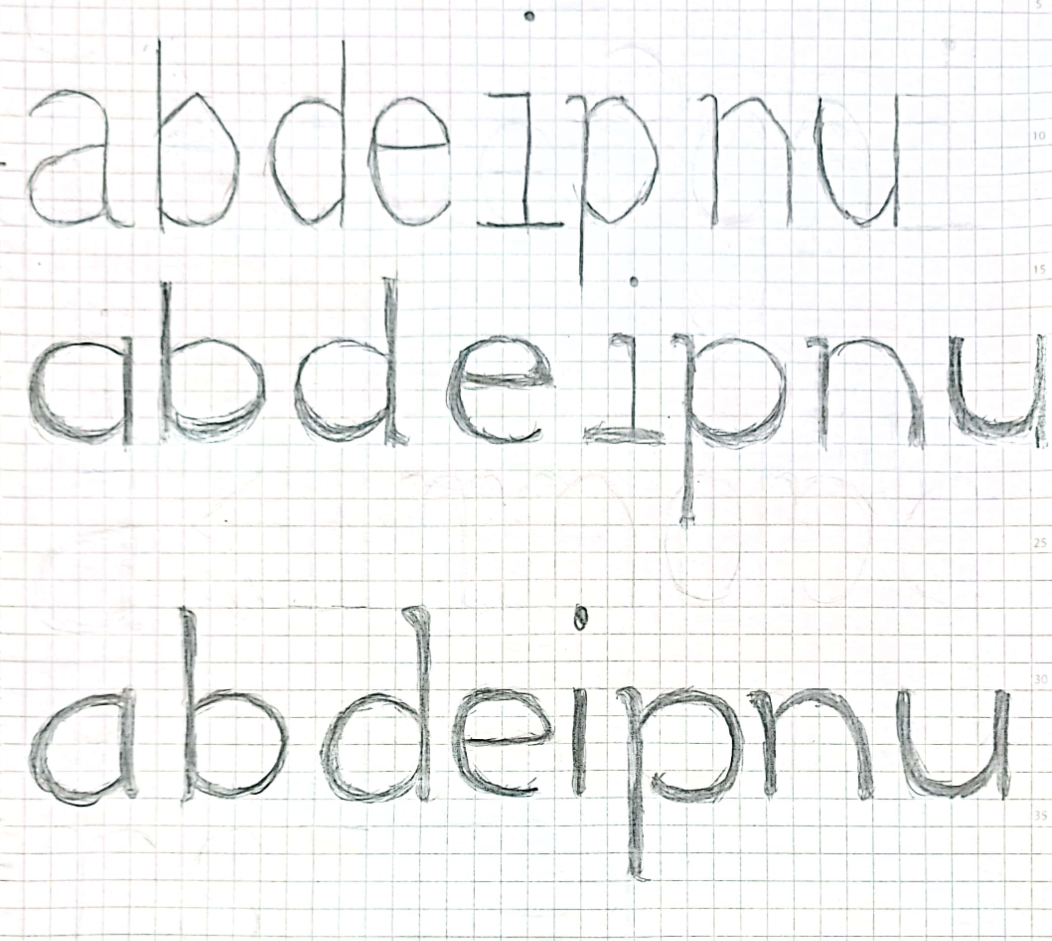
Stage 1
On this initial stage, I
use the Sylexiad font as a reference as to make the font
organized.

|
|
Fig 3.4 Draft 3: Uppercase, Lowercase and Punctuation progress
(5/11/2023)
|
Stage 2
I notice that the ascenders are not long enough to be noticeable, I
extended the ascender.
The letter "a" looks to similar to "d" "b" "p" and I change the
shape. The curve on number "3" "5" and "9" look too similar, so I
change each of them to look different.

|
|
Fig 3.5 Draft 3: Letter Adjustments (8/11/2023)
|

|
Fig 3.6 Draft 3: Number Adjustments (8/11/2023)
|
After testing the font sequence by forming it to sentence there the
font shape might look suitable.
-38.jpg)
|
Fig 3.7 Draft 3: Sentence Sequence Test (11/11/2023)
|
When I export it into Font Labs to create the font presentation, I notice
the letter "d" and "a" looks out of place, and some of the letters very
similar they blend together with is not my intention.

|
|
Fig 3.8 Lowercase Kering (11/11/2023)
|

|
|
Fig 3.9 Uppercase side-baring (11/11/2023)
|
Font Presentation Draft 1
I wasn't sure how to create the formant of the presentation. I reference
a couple of poster references on the internet. two of the drafts that I
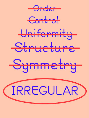
created is center around the comic sans on how useful the font is
despite the negative reception. The third draft list
down the synonyms describing, the fact that dyslexic find letter
confusing is that all letters are uniformed, and being irregular is
the key to make it readable.
Inspiration

|
|
Fig 4.1 Font Presentation Reference (12/11/2023)
|

|
|
Fig 4.2 Draft 1: Layout 1 (12/11/2023)
|

|
|
Fig 4.3 Draft 1: Layout 2 (12/11/2023)
|
|
|
Fig 4.4 Draft 1: Layout 3 (12/11/2023)
|
Stage 3
In order to make the letter
look stable measure the width of the Verdena font (according to
an article Good Fonts for Dyslexia by Luz Rello and Ricardo Baeza-Yates Verdena one for the most
preferred font for dyslexic)
and apply to my font. Frist, I write down the
recommend control letters of font creation, which are. "H" "n" "o" "y" then I draw a box for the measurement. The letters without an
arch use the "H" and "n" measurement. Letter with arches I
use the "o" and "y" measurement.

|
|
Fig 5.1 Width Measurement failed attempt. (18/11/2023)
|

|
|
Fig 5.2 Using rectangle to measure Width Measurement on Verdena
(18/11/2023)
|

|
|
Fig 5.3 Drawing "H,O" and "n,o,y" within the box (18/11/2023)
|
Guidelines

|
|
Fig 5.4 Guidelines Height (18/11/2023)
|
Guideline Height:
-
Ascender - 624px
-
Capline - 524px
-
X-Height - 400px
-
Baseline - 0px
-
Descender - 225px
Shape Transformation
Just like before I use lines and shapes to create my font. I convert
them into outline to make a whole entire letter.

|
|
Fig 5.4 Line Transformation (18/11/2023)
|

|
|
Fig 5.5 Line Transformation, Outline (18/11/2023)
|

|
|
Fig 5.6 Shape Transformation (18/11/2023)
|

|
|
Fig 5.7 Shape Transformation, Outline (18/11/2023)
|
Progress
The colored box shown
in (Fig 5.7) green, yellow and red boxes serves as width measurements.
From there I construed the font using shapes and lines and then I
converted into outline to refined it.

|
|
Fig 5.7 Font progress (18/11/2023)
|

|
|
Fig 5.8 Font progress, Outline (18/11/2023)
|
Feature to identify similar letters.
I study the characteristics of the Inconsistent font, dyslexie
font, and Sylexiad font for inspiration on how to make each of the of the similar letter
distinctive. some the letters such "B", "R", "P" and "Q" and "O" are one
that I notice that was similar based on my observation, that never
applied in any font.

|
|
Fig 6.1 Unique Features of Q and O (18/11/2023)
|

|
|
Fig 6.2 Unique Features of B, R and P (18/11/2023)
|

|
|
Fig 6.3 Unique Features of V,W,X and Y (18/11/2023)
|

|
|
Fig 6.4 Unique Features of E and F (18/11/2023)
|

|
|
Fig 6.5 Unique Features of i, j and l (18/11/2023)
|

|
|
Fig 6.6 Unique Features of v, w and u (18/11/2023)
|
|
|
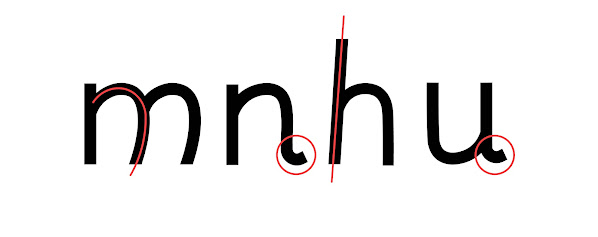
Fig 6.7 Unique Features of m,n,h and u (18/11/2023)
|

|
|
Fig 6.8 Unique Features of r and m (18/11/2023)
|

|
Fig 6.9 Unique Features of a,b,d,p,q and g (18/11/2023)
|

|
|
Fig 6.10 Unique Features of 6 and 9 (18/11/2023)
|

|
|
Fig 6.11 Unique Features of 0 and O (18/11/2023)
|
Calligraphr
My Font lab Trial ran out, so I transferred my fonts to
calligrapher,

|
|
Fig 7.1 Caligraphr (18/11/2023)
|
Font Presentation Draft 2
I was notified it was required for the format to be in 1024px
x 1024px. Even though Mr. Vinod provided us samples of
inspiration. I was unsure on how to plan my layout. i use
the same reference in draft 1 (Fig 4.1)

|
|
Fig 7.2 Draft 2 Layout 1 (18/11/2023)
|

|
|
Fig 7.3 Draft 2 Layout 2 (18/11/2023)
|

|
|
Fig 7.4 Draft 2 Layout 3 (18/11/2023)
|

|
|
Fig 7.5 Draft 2 Layout 4 (18/11/2023)
|

|
|
Fig 7.6 Draft 2 Layout 5 (18/11/2023)
|

|
|
Fig 7.7 Draft 2 Layout 6 (18/11/2023)
|
Punctuation Update
Previously, the punction with that has a comma shape I round with tiny
stroke, I figure it is too small for people with dyslexia to see it, so
I change the stroke to make more obvious.

|
|
Fig 7.8 Punctuation transformation (18/11/2023)
|
FontLab
i use the D7.04 Maclab computer. to put all of my font into FontLab.
When kerning I use the side bearing guild provided in Teams.
.jpg)
|
|
Fig 8.1 Side Bearing Guild Uppercase (22/11/202)
|
.jpg)
|
|
Fig 8.2 Side Bearing Guild Lowercase (22/11/2023)
|
|
.png)
|
|
Fig 8.3 Uploading font in Fontlab
(22/11/2023)
|
|

|
|
Fig 8.4 Side baring of H and O (22/11/2023)
|
|

|
|
Fig 8.5 Side baring of all Uppercase (22/11/2023)
|
|

|
|
Fig 8.6 Side baring of n and o (22/11/2023)
|
|

|
|
Fig 8.7 Side baring of all Lowercase (22/11/2023)
|
|

|
|
Fig 8.4 Side baring of "The quick brown fox jumps over
the lazy
dog" (22/11/2023)
|
|

|
|
Fig 8.5 Side
baring of Number (22/11/2023)
|

|
|
Fig 8.6 Side baring of Punctuation (22/11/2023)
|
Final Typeface

|
|
Fig 8.7 EasyRead Font (22/11/2023)
|
Presentation
Mr Vinod created samples for Illustrator, to help me give me an idea of
how-to layout a font presentation.

|
|
Fig 9.1 Font Presentation created by Mr. Vinod (24/11/2023)
|
I pick up a color scheme from color hunt. and I use reference
from posters from the internet. and my friend font
presentation.

|
|
Fig 9.2 Color Scheme (25/11/2023)
|
 |
| Fig 9.3 Font Presentation Process (25/11/2023) |
The artboard located on the (top, left) has newspaper background the
reason being that Newpaper typically have a large paragraph of small text.
Based on personal experience I find it hard to process the information
written in a larger body of text.
The artboard located on the (top, right), displays the letter "p,q,b,d" to
show the comparison of the letters distinctive feature.
The artboard the located on the (bottom, left) is based off a word search
puzzle. It has randomized letter with hidden word, this based my personal
experience, as I always get lost when reading a paragraph.
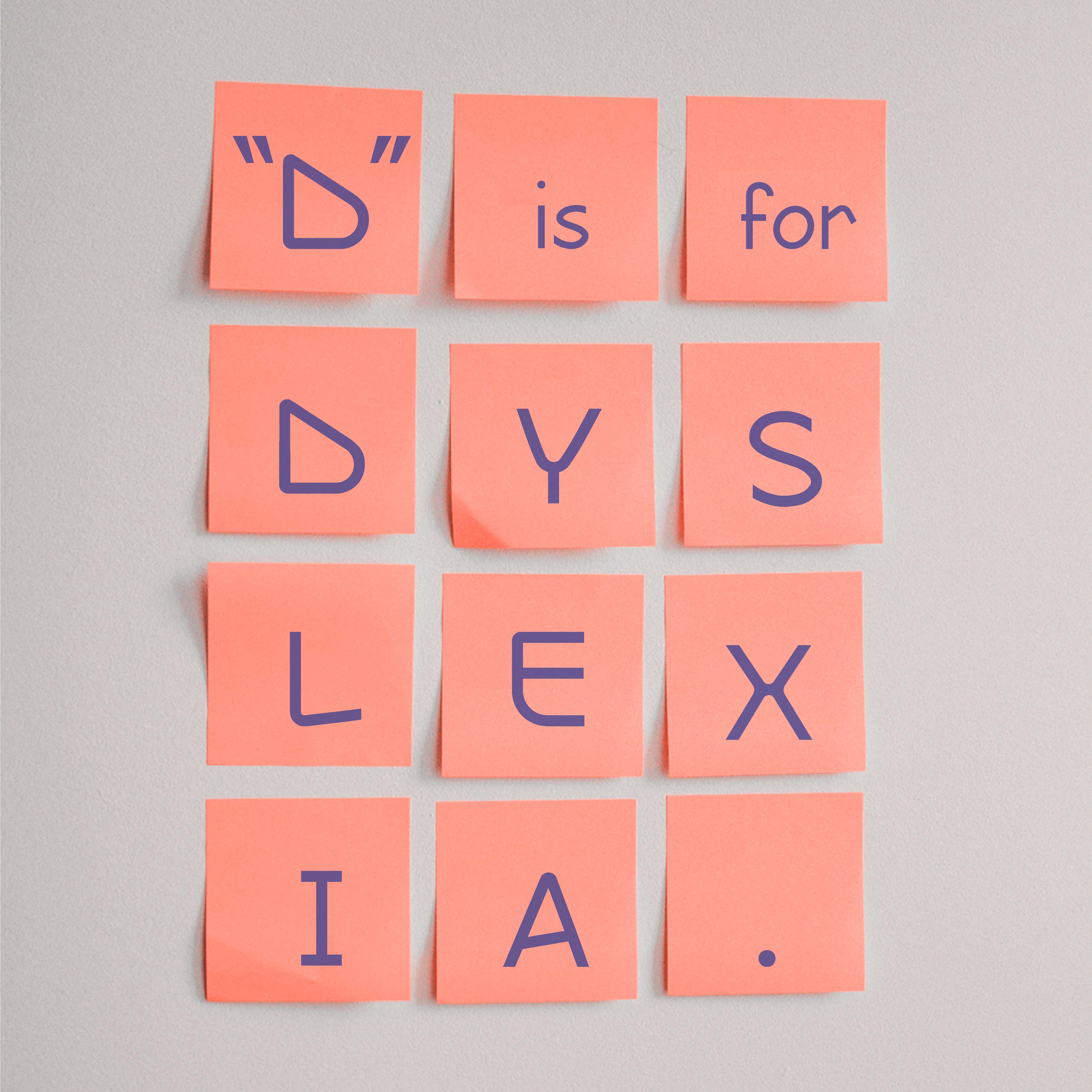
The artboard (on bottom, right) has the sentence, "D" is for Dyslexia
which is play on the movie "V" for vendetta. This is meant to show that my
typeface is oppose on the usual norm of font creation which consistency.

|
|
Fig 9.4 Font Presentation Upadated (25/11/2023)
|
Application
Mr. Vinod suggests applying my font on children's books, he suggests that
I use the Miffy books and created samples in Illustrator for me to
refer.

|
|
Fig 9.5 Font Application by Mr Vinod (24/11/2023)
|
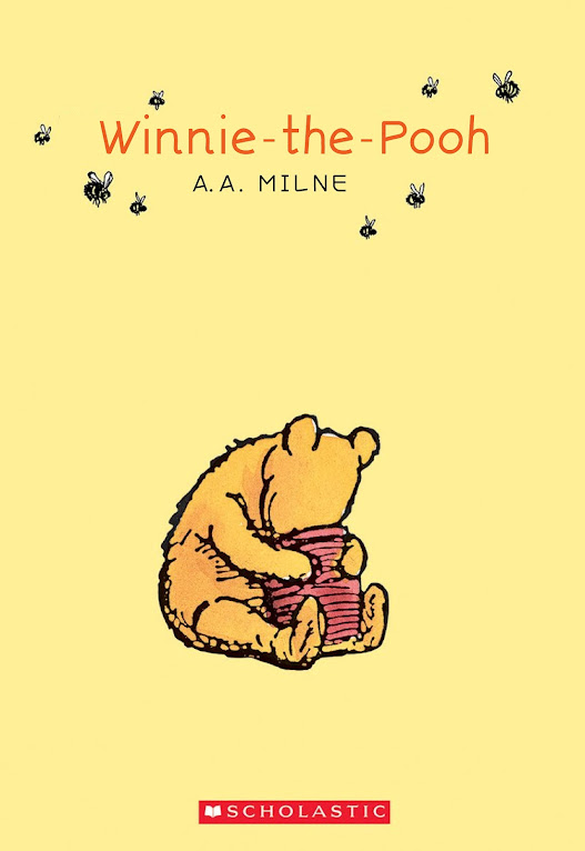
The children that I selected for my application are Winnie the Pooh,
Paddington and Miffy. I replaced the existing font with my own font, on
the book cover and book pages.

|
|
Fig 9.6 Font Application process (25/11/2023)
|
According to Mr. Vinod, display book pages in 2 pages, makes it less
confusing. As I did the pages for Winnie the Pooh and Paddington, Mr Vinod
mention that they all look blurry and find pages that are simpler. I redo
is again, but I can't find a high-quality image for Paddingtion, so I use
Angelina the ballerina books.

|
|
Fig 9.7 Font Application Updated (29/11/2023)
|

|
|
Fig 9.6 Font Application Updated 2 (29/11/2023)
|
I found out the Miffy book pages are blurry, so I change, layout. I
found out the Angelina the ballerina book pages are too big, and
it takes up too much space in my pdf file. It the page
was unnecessary.

|
|
Fig 9.6 Font Application Updated 3 (1/12/2023)
|
Final Outcome
Downloadable Font: https://drive.google.com/file/d/1jeBcLbYMJVPEg3nbV2yQerjypYacAmn5/view?usp=drive_link
Font Presentation

|
|
Fig 10.1 Final "EasyRead" Font Presentation Layout 1 JPEG (1/12/2023)
|

|
|
Fig 10.2 Final "EasyRead" Font Presentation
Layout 2 JPEG (1/12/2023)
|

|
|
Fig 10.3 Final "EasyRead" Font Presentation Layout 3
JPEG (1/12/2023)
|

|
|
Fig 10.4 Final "EasyRead" Font Presentation Layout 4
JPEG (1/12/2023)
|

|
|
Fig 10.5 Final "EasyRead" Font Presentation
Layout 5 JPEG
|
|
|
Fig 10.5 Final "EasyRead" Font Presentation
Layout PDF
|
Font Application

|
|
Fig 10.6 Final Font Application 1 JPEG (1/12/2023)
|

|
|
Fig 10.7 Final Font Application 2 JPEG (1/12/2023)
|
|
|
Fig 10.8 Final Font Application 3 JPEG (1/12/2023)
|

|
|
Fig 10.9 Final Font Application 4 JPEG (1/12/2023)
|
Fig 10.10 Final Font Application PDF (1/12/2023)
FEEDBACK
Week 8
General Feedback
Specific Feedback
-
Use reliable research.
-
Curlz and Papyrus are not technically the most
hated font.
-
The problem should be set specifically in
Malaysia.
-
Go with Idea 2 since I am dyslexic.
-
Use the grid to make the font and keep the process.
Specific Feedback:
-
Go with a different approach other than the one I
sketch out.
Week 10
General Feedback
-
Know to true purpose of the font.
-
Create the lowercase letters next to the Uppercase
Letters
Specific Feedback
-
The thickness of the underside of the font is just right.
-
Make sure the letters are organized.
Week 11
General Feedback
-
After finish creating the font print it out and put into
Fontlab
Specific Feedback
-
Make sure to upload the reference font in my
e-portfolio.
Week 12
General Feedback
-
Refer the side-baring guild upload in Teams.
-
For capital letter start with "H" and "O"
Specific Feedback
-
Prepare the concept of draft 3 of the font
presentation.
-
The font presentation serves as an antithesis to the regular font.
-
Kern the letter properly.
Week 13
General Feedback
-
Continue on design the font presentation and
application.
Specific Feedback
-
Find your main font presentation reference
in Teams.
-
Don't use too many colors use a minimum of
2 colors.
Specific Feedback
-
The font presentation looks good.
-
Present two pages in the Font Application
-
Use a simple page formant where the
illustration is right while the text is on
the right.
REFLECTION
Experience
Although I enjoy, creating a font that breaks the rules the basic
rules of font creation. But even though it is for a good reason, I am
conflict with that idea. Since consistency is ideal to make an
effective font. I did my best effort to make the font stable yet
maintain the true goal the font. It took a lot of trial and error to
get it right. Despite the process being complicated that I thought, In
the end I know the purpose of the font is important.
Observation
Some part of the assignment I don't know how to start,
especially the font presentation where, I look at the sample
Mr. Vinod provides me. Majority of them have a big format
size, while I am limited with a 1024px x 1024px formant. On top of that
the sample have a lot of written information making me more
confuse. I find it better look around to see my friend's layout to
give me an idea on how to plan the composition of the
layout.
Findings
I search on the Internet for information on how to create
dyslectic. I found out there are a lot of strict rules to follow to
make it effective. Some information, about dyslexic quite
board, even a dyslexic myself haven't notice. and it hard to keep track
on the information, since levels dyslexic varies on
different people and there no such as perfect font for every single
person with dyslexic.
FURTHER READING
Think with Type: A Critical Guide for Designers, Writers, Editors
& Students
by Ellen Lupton
Humanism and The Body
In the 15th century Italy, the era of gothic scripts has come to an
end, as humanist writers and scholars switch to another typeface which
is lettera antica. A classic mode of handwriting with wider and more
open forms. The shifted to lettera antica was part of the Renaissances
of classical art and literature.
Typefaces such as Garamond, Bembo, Palatino, and Jenson are known as
"humanist", even though it is an old typeface it can be still reused
in modern times. The revivals of historical typefaces are designed to
conform with modern technologies and the current demands for sharpness
and uniformity.
Banishing the Body from Typography
Geofroy Tory - his style of letters creation is the ideal
human body is used as a reference. When creating the letter, A, he
wrote: "the cross-stroke covers the man's organ of generation to
signify that Modesty and Chastity are required, before all else, in
those who seek acquaintance with well-shaped letters.
Louis Simonneau - Instructed by a royal
committee. Simonneau is responsible for designing model letterforms
for the printing press of Louis XIV. He use a finely meshed grid to
design the letters. A royal typeface (romain du roi) was then created
by Philippe Grandjean based on Simonneau's engravings.
William Caslon - In 18th century, England. Caslon created a typeface that has
crisp, upright characters that appear, as Robert Bringhurst has
written, "more modelled and less written that Renaissance form.
John Baskerville - A printer from England during the 1750s and 1760s. His goal
was to surpass Calson by creating sharply detailed letter with a vivid
contrast of thick and thin stokes. Unfortunately, his work didn't meet
the standards of his contemporaries, as was called an amateur and
extremist.
Giambattiata Bodoni - In the late 18th century Bodoni created a typeface that has an
unmodulated contrast between thick and thin strokes with razor-thin
serif unsupported by curved brackets.
REFERENCES
Rello, L & Baeza-Yates,R. (2013)
Good Fonts for Dyslexia. ASSETS
Fig 4.1:


.jpeg)


-27.jpg)


-38.jpg)


.jpg)
.jpg)
.png)


Comments
Post a Comment