20.2.2024 - 27.3.2024 (Week 3 - Week 4)
Caitlin Ong Lynn Dee / 0343801 / Bachelor of Design (Hons) in Creative
Media
Information Design
Project 1
CONTENTS
LECTURE
INSTRUCTION
Project 1: Instructible Infographics Poster
Requirement:
- Use Graphs, charts, and diagrams.
-
Poster size: 1240 x 1750 pixels or 2048 x 2048 pixels
Among all of the Pasta Grannies Video I choose to use calcioni which is made by Grandma Rita.
Fig 1.1 Pasta Grannies:How to make calcioni video (20/2/2024)
Sketches
Looking though Pinterest for inspiration. And I have created six sketches
to plan the infographic's layout.

|
| Fig 1.3 Idea Sketches (20/2/2024) |
Themes
I analyzed the video in order to get a full grasp on Rita's
personality. From my understand, Rita is more reminiscent of the past as
she uses the knowledge of what she has learnt in her youth, and she uses
old fashion techniques like using a key to seal the calcioni dough.
Since the calcioni is considered as a rustic dish in Italy, I decided
that my infographic will have a retro aesthetic.

|
| Fig 2.1 Mood board (21/2/2024) |
Color Scheme
I looked through Pinterest to find
suitable earth color scheme. In the end I choose the one in the very left
shown in Fig 2.2.

|
| Fig 2.2 Selection of Color Schemes from Pinterest (21/2/2024) |
 |
| Fig 2.3 Chosen Color Schemes (21/2/2024) |
Asset Art style Inspiration
For my assets I researched for
inspiration to recreate the appropriate art style for the
infographic

|
| Fig 2.4 Food Illustrations from Pinterest (21/2/2024) |
Font Style
I look though Google Fonts to find the
appropriate font for the infographic poster. The font I am going for is
a Sans serif and handwritten font.
Wireframe
I picked sketch 3 as my chosen layout. While working on the infographic in Photoshop I wrote down all of information down and plan out the flow of the information.

|
| Fig 2.6 Infographic poster Wireframe (21/2/2024) |
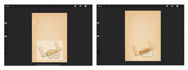
I have created illustrations in Procreate each and every one of them that showcase all of the step- buy step process of making the calcioni.

|
| Fig 3.3 Step 2 illustration process (24/2/2024) |

|
| Fig 3.4 Step 3 illustration process (24/2/2024) |

|
| Fig 3.5 Step 4 illustration process (24/2/2024) |

|
| Fig 3.6 Step 5 illustration process (24/2/2024) |

|
| Fig 3.7 Step 6 illustration process (24/2/2024) |

|
| Fig 3.8 Step 7 illustration process (24/2/2024) |

|
|
|
Initial Final Outcomes
After I submit my final work, I was given feedback by Mr. Shamsul saying that I need to improve my work further. In my final work I change the typeface, rearrange the content and replace the old paper background to a wooden cheese board to fit in the rustic cooking aesthetic.

|
| Fig 4.1 Initial Final Infographic Poster No.1 (24/2/2024) |
Refer to Project 2:
Information Design Project 2 (0343801.blogspot.com)

|
| Fig 4.2 Initial Final Infographic Poster No. 2 (1/3/2024) |
Final Outcome
 |
| Fig 4.3 Final Infographic Poster (25/3/2024) |
FEEDBACK
Week 3
- Mr. Shamsul accepts Sketch 3 as my chosen composition. I should research on my chosen color, typeface and create the assets for my work.
- Make the calcioni image, smaller and refer to one of the references I pick out.
REFLECTION
Experience
Translating the information from the video into a poster was a challenging process. Mr. Shamsul advised that one of the most important priorities is to make the poster easily understood and yet create it visually appealing. The art direction was challenging as it has to fit the personality of the presenter in the video and also to fit the concept of the origin country of the spread.
During the process of creating the poster I was completely stuck on the compositions and the art direction, and I struggled to find references that is easy to follow and yet not overload with too much information. But thanks Mr. Shamsul's, feedback I managed to further improve the composition.


Comments
Post a Comment